Analysing the UX Design of the FIFA Mobile App
A constructively critical look at FIFA's mobile version


I wanted to exercise my UX analysis outside of console games. So I started with a game that I knew I could test with many different people, and at the same time, has some complexity in which to instruct players during onboarding. So I decided to make a high-level experience analysis of the FIFA mobile app and gather challenges, pain points, opportunities, potential solutions, and recommendations.
How to organise the work?
The first thing I did was to download the app and freely experiment with the analysis in mind - but not too focused on UX that I would miss the onboarding experience as a player.
I try to experiment like I’m just casually playing the game, and only if the pain sticks in my head do I note it down in the end. I’m conscious of my limits and challenges; they also weigh the analysis until I find more people to test it with.
I look back at the app with these issues in mind and experiment with it through a more critical UX lens. Then, I reworked the issues a bit with more technical detail. At the end of the experimentation, I note both the pain points and solutions I like - it’s always good to have both perspectives.
It’s time to test with players. I tested the onboarding and app and sense-check the topics I collected. I always try to have at least five people. I’m lucky because I gathered five experienced and newbie players with FIFA Mobile.
Together with the testing, I performed a UX analysis of the entire app in light of UX heuristics. I gathered a couple of issues that also overlapped with the ones from the testing with users.
I summarised and organised the issues I had and connected them into five main challenges: onboarding, personalisation, “My team” mode, “Points” inside “Store”, and the Edit menu.
With the issues raised and organised, I always think providing potential solutions is vital. If you check my articles, I always try to do that for three main reasons. First, never forget when you think you have found a new challenge or pain point, the people who worked on the system you are analysing already know about it. Time, money, and technical constraints limit the solutions we can give or the time we have to work on the problem.
Second, I think it’s a good rule in life that whenever you point out an error or a mistake, you also give a solution or instructions on how to improve it. If anything, people might need a new vision, someone with more time, or a helping hand. If I make a mistake, I want people to help me grow. So I try to do the same… and in a way, I’m also able to grow and evolve. Just pointing out things that are not ok is easy. To create and help is hard work. And finally, I do these exercises to learn and grow in a fun and creative way. It’s cool and incredible to rework and rethink the games I love.
Analysis of FIFA Mobile
I tested the game on both an Android smartphone and tablet, by myself and with five other people. I also tested inside a house with controlled light and outside the house in 2 different weather conditions (sun and cloudy) - really lucky that it was the beginning of springtime in Porto.
The 5 main topics I covered:
- Onboarding
- Personalisation
- "My Team" mode
- "Points" inside "Store"
- Edit Menu
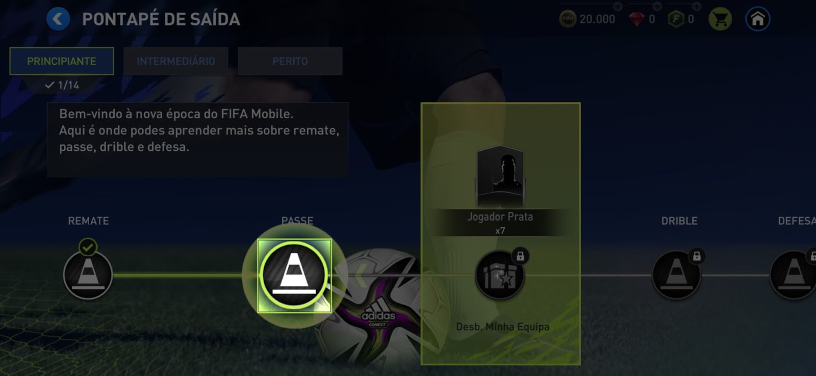
1 - Onboarding 🚀
The onboarding has a flow and logic that help players be introduced to the game. It’s clear and easy to follow. But sometimes, it is too closed and does not let players explore the different modes. Some spaces are introduced without context: it’s difficult to know their goals and where they are localised. They are sometimes introduced even if it’s impossible to do anything inside them.
Giving players more freedom and space to explore the modes as they are introduced could increase the time spent on onboarding, but the benefit would be a better understanding of each.
🔎 Challenges
- The background is too challenging to see, and we lose the opportunity to teach where the player is;
- Because of point 1, when we leave the “Kick-off” to check the unblocking of the manager mode, we lose track of how to go back again to the manager, and we are not given context or an overview of this mode;
- Some features and rewards are “introduced”, but it is not clear how they work (e.g., Exchange and FIFA points);
4. Not possible to leave onboarding: this is frustrating when exploring after unblocking some features and when we need to correct a setting (e.g., language and graphics).
💪 Potential solutions/recommendations
- Give a bit more light to the background since the next step on the onboarding is already very visible;
- Allow exploration after the introduction of “My Team” mode instead of forcing users to go back to “Kick-off” - learn context and more than one way to do something;
- Take more time to standardise the onboarding while exploring new modes;
- Only open new modes if it’s possible to do something inside them.
- Regarding challenge 4: have the close button shows up after clicking on the darkened area;
- Trigger onboarding to continue if a player goes back to a mode that was left;

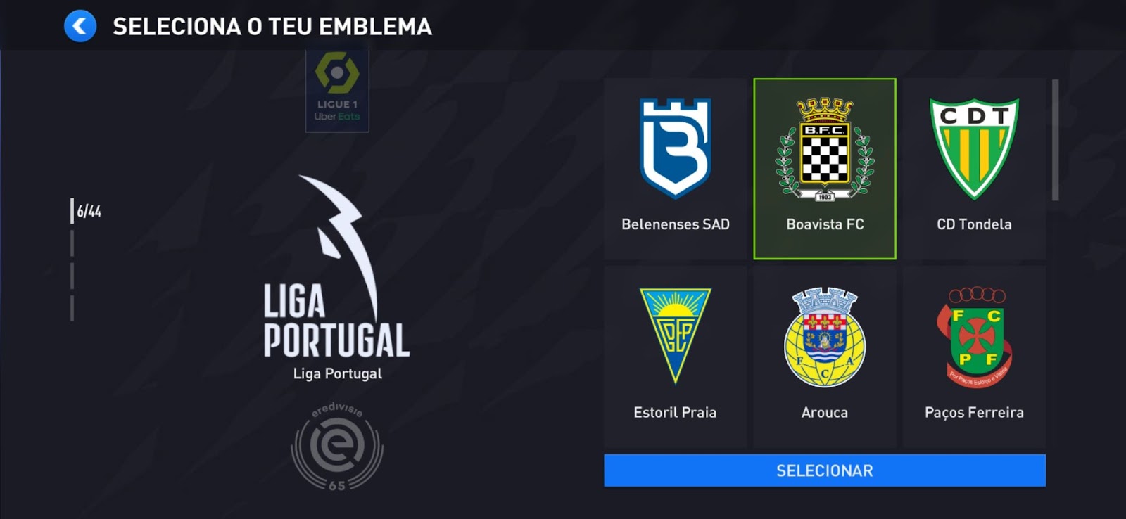
2 - Personalisation 🥸
Personalisation options are available in FIFA Mobile. People who love football have a deep passion for their team - when they play FIFA; they know what team they want to choose. They might want to see everything available, the teams they know, and the leagues they follow, but it’s the one close to their heart that is usually picked.
Most improvements regarding this theme are closely connected to having more efficiency in finding and selecting their teams and giving them a greater sense of control by seeing their crest and kit in strategic places.
🔎 Challenge and opportunity
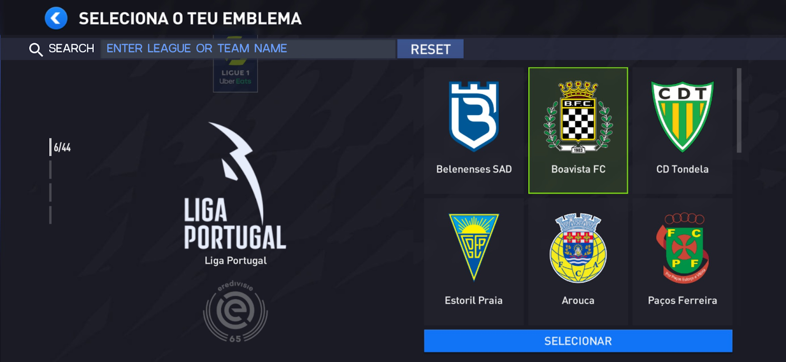
- To select Crest, the player needs to go through 44 options of leagues to see each one of the crest options inside - it’s divided into four sections, and while looking for a specific league, it keeps jumping from section to section or takes too long to find the wanted one;
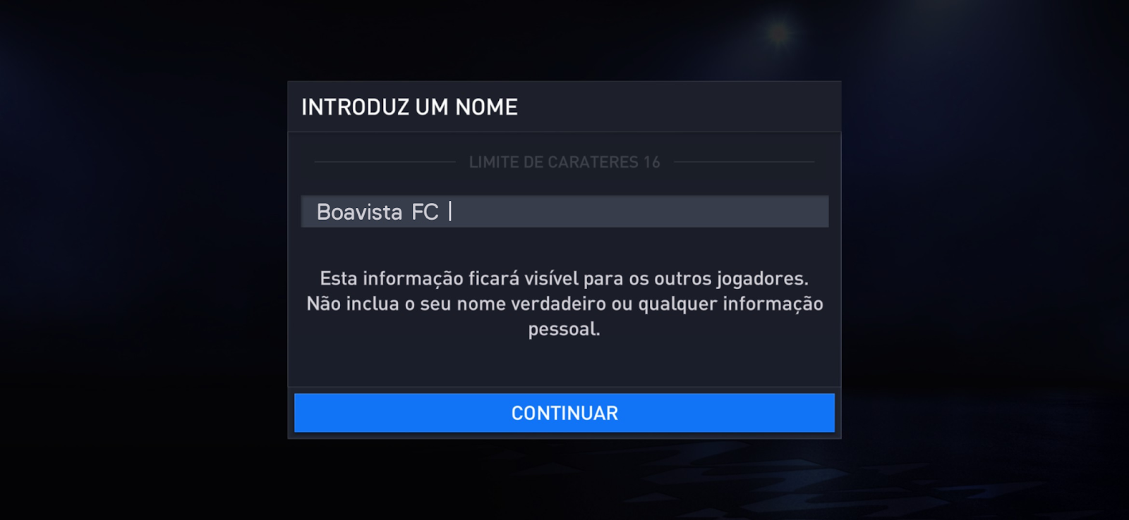
- (Opportunity) After selecting a Crest, onboarding takes players to choose a team name, and the placeholder is empty;
💪 Potential solutions/recommendations
- Search league or team input text;
Solution 1 follows the standard of opening a modal to insert the search data, divided between league and team.
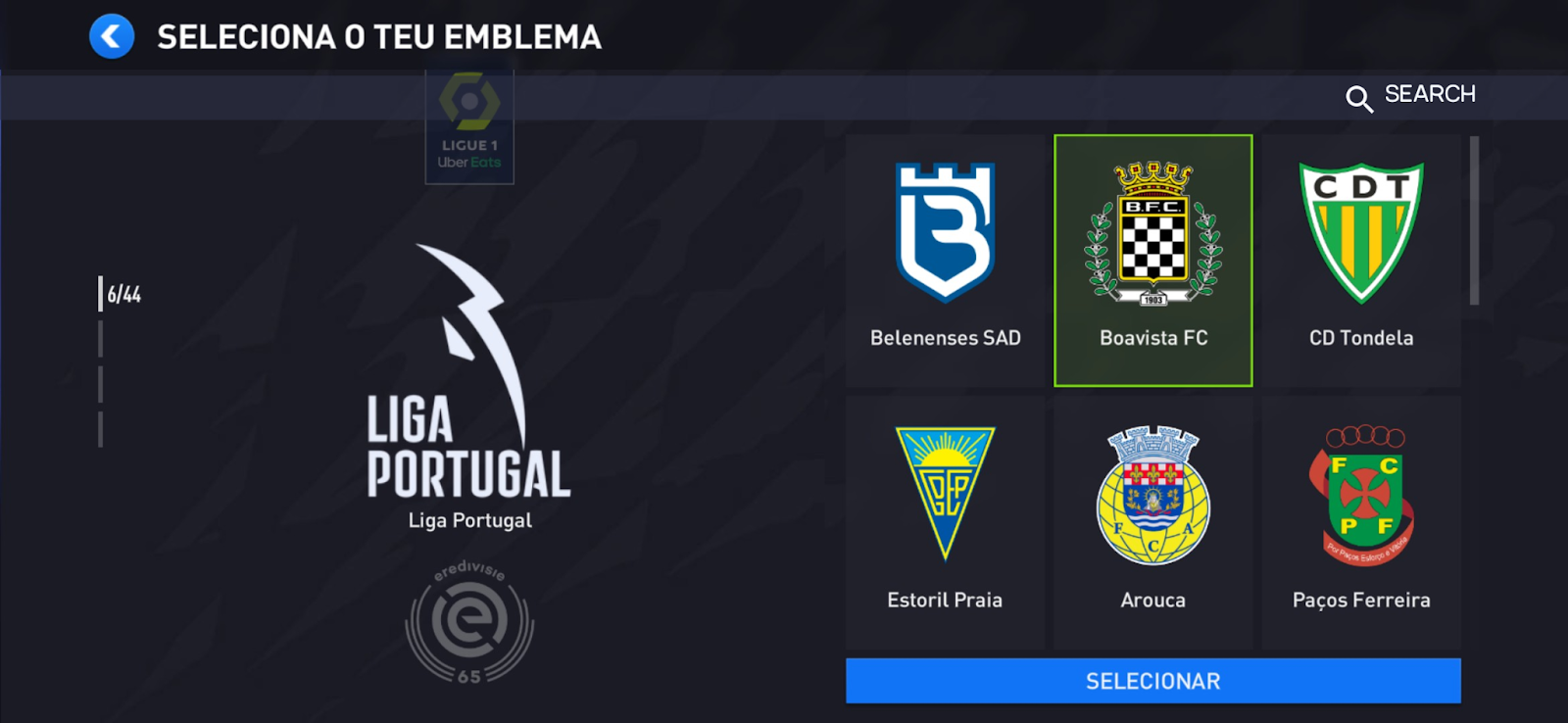
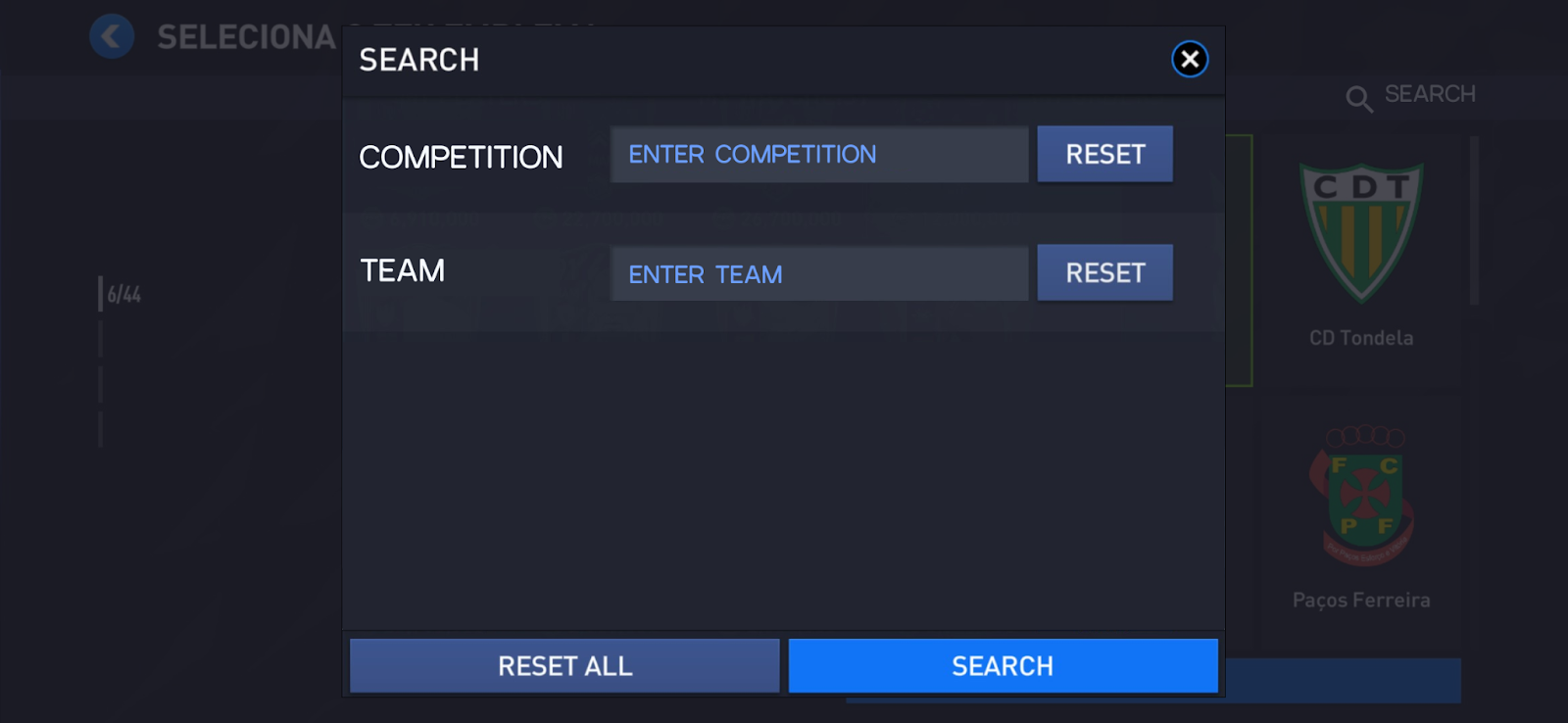
Solution 2 has the search directly on the screen and can search for a league or team.
- Regarding challenge 2: Default placeholder with the team name of the selected emblem.
- (Opportunity) After selecting the Kit, the players on the menu have another kit.
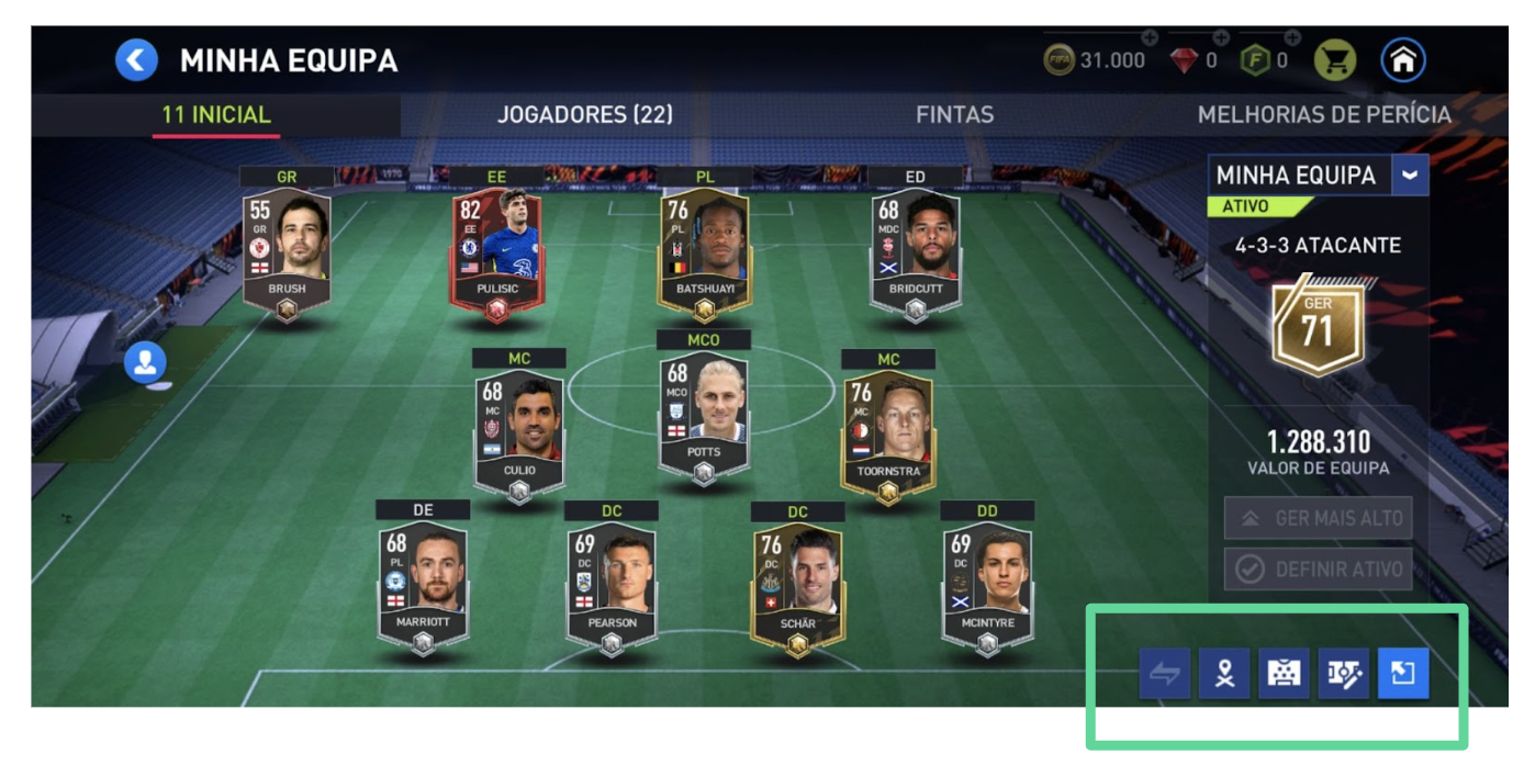
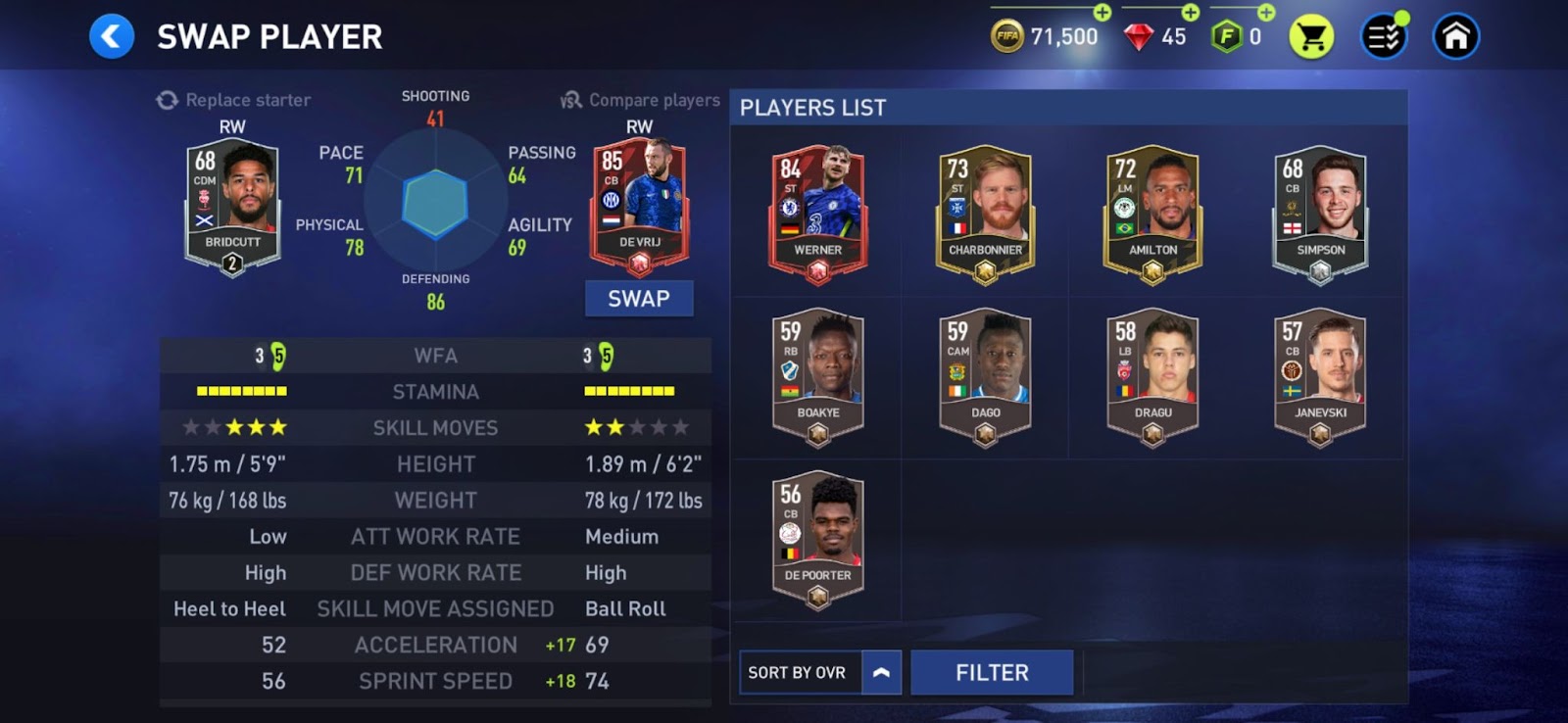
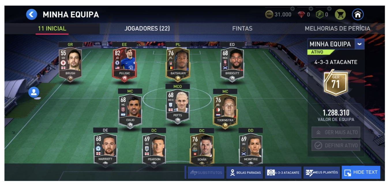
3 - ”My Team” mode 🤝
“My Team” mode has some complex information on the screen with many actions that can be performed. It’s easy to lose visibility and readability of both actions and elements. In this mode, probably due to the complexity compared to others, it’s visible (no pun intended) in buttons and some copy. Consistency with the rest of the app is followed. Still, I would say it requires a bit of thought. It’s also a natural consequence of increased complexity: it requires components and patterns to evolve faster than a design system can be built and migrated. This is a current fight we are having in my daily job, so I can feel these pains every single day.
I used the “My team” mode to reflect on these two topics.
🔎 Challenge and opportunity
- Default icons without text are difficult to interpret;
2. Buttons without hierarchy confuse players on how to perform actions - sometimes the main action has a button with darker light, or there is no primary button on the screen;
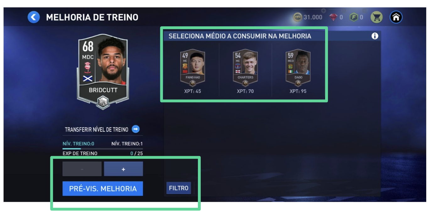
3. Modals have a “Confirm” button that looks to confirm the action but only closes the modal (e.g., Train).
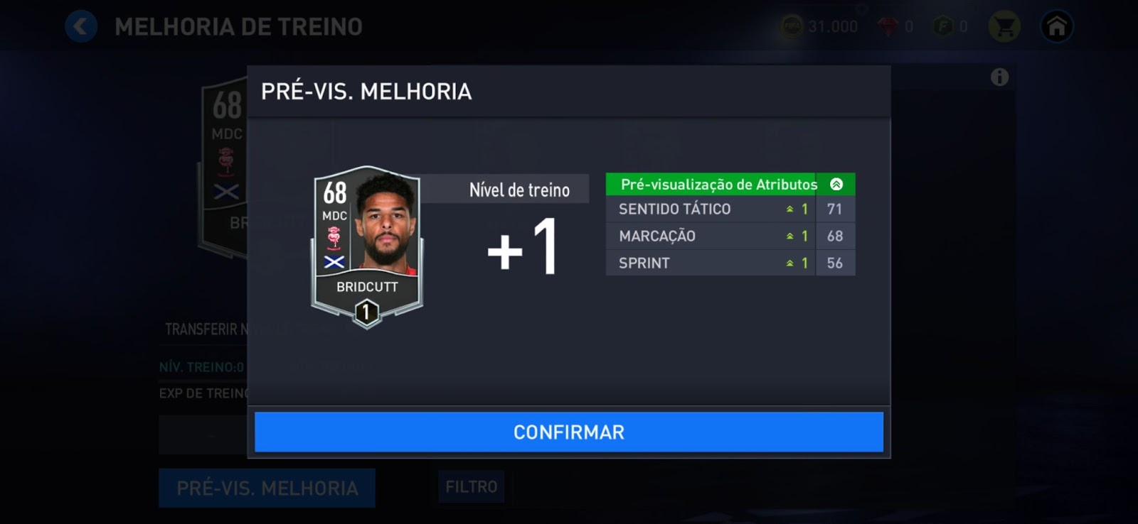
💪 Potential solutions/recommendations
- Have buttons with text by default and add text to the “hide button text”;
- Rework some of the buttons' hierarchies
- Put a close button and review the text indicating the action in modals that do not have any action, only information to show;
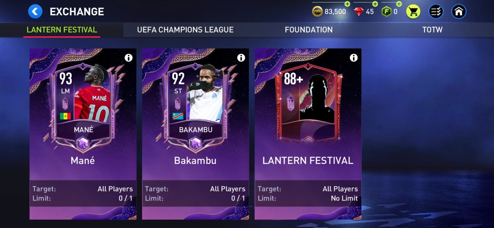
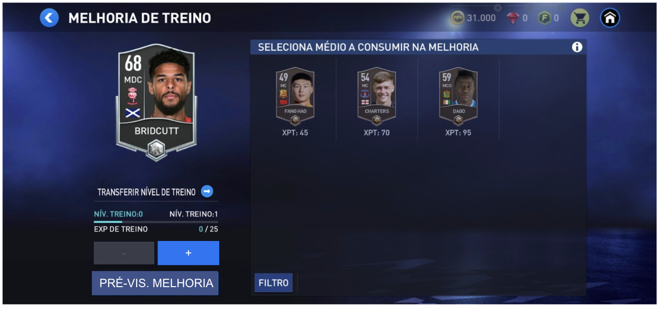
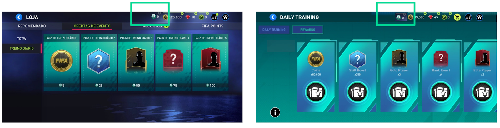
4- ”Points” inside “Store” 💰
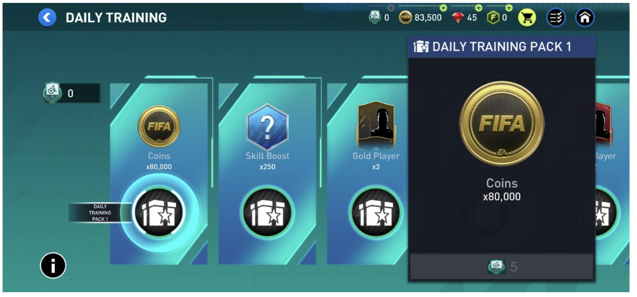
“Points” inside “Store” also have some issues regarding consistency of where and when the amount of “Points” are shown. To save some space on the screen, the amount of “Points” is displayed when the information is needed or can be used, but in some cases, it takes more clicks than it should. There’s even an example of a trade of points that is enabled even if there are no points available. This forces the player to click to buy something, and only after that action do they find they do not have enough currency.
🔎 Challenges
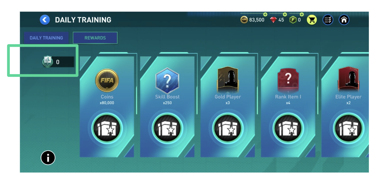
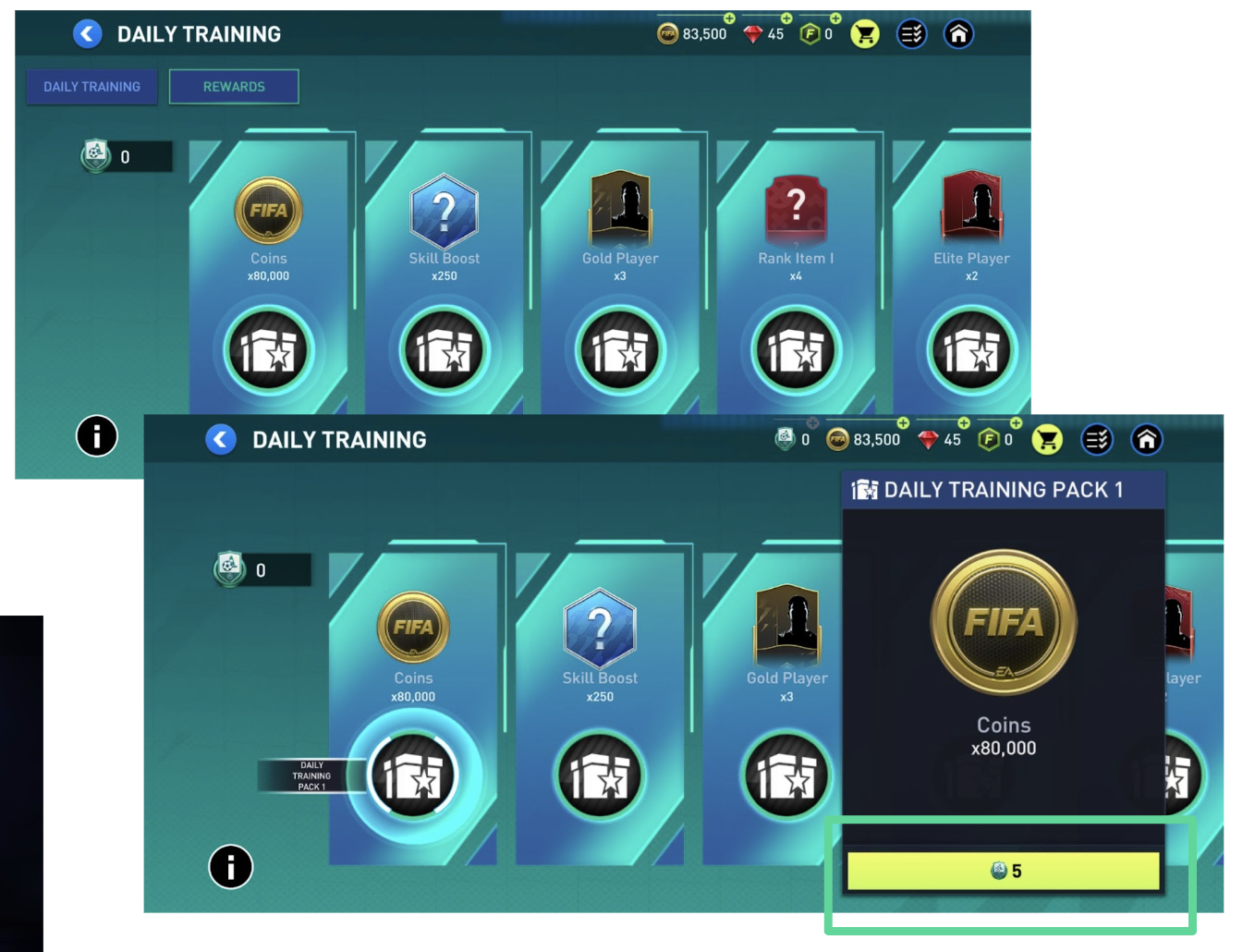
- Only shows total training points and league points the player has after selecting a pack and not on the shelf with all packs;
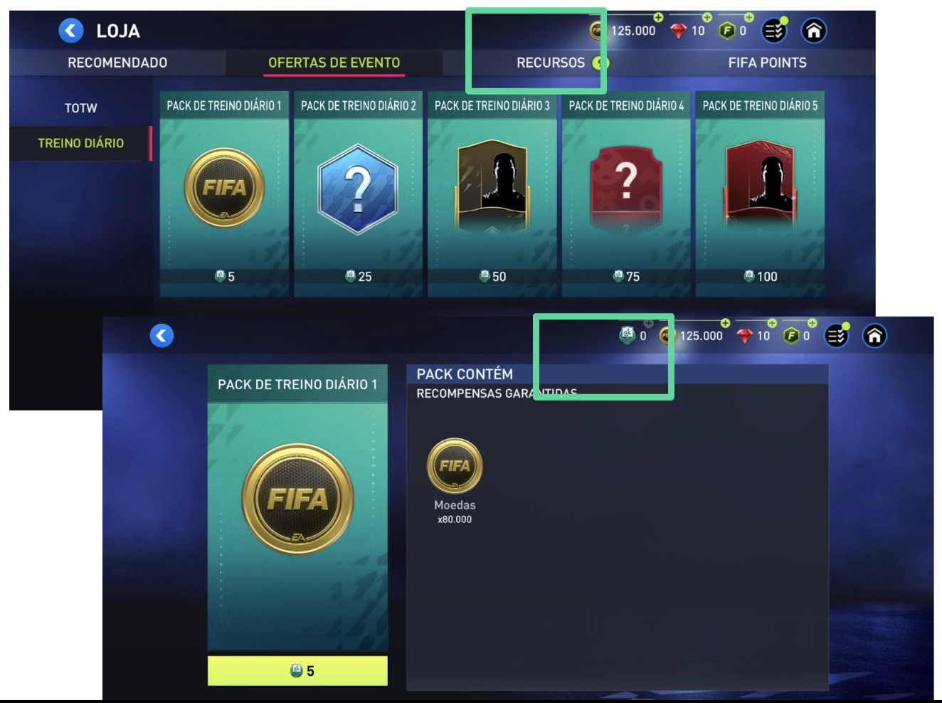
2. On “Daily Training”, the total training points are in different places - but it’s also informing players of the amount to buy something;
3. Even if it’s not possible to buy something, the button is still enabled and opens a modal to tell users it’s not possible to buy, forcing two clicks.
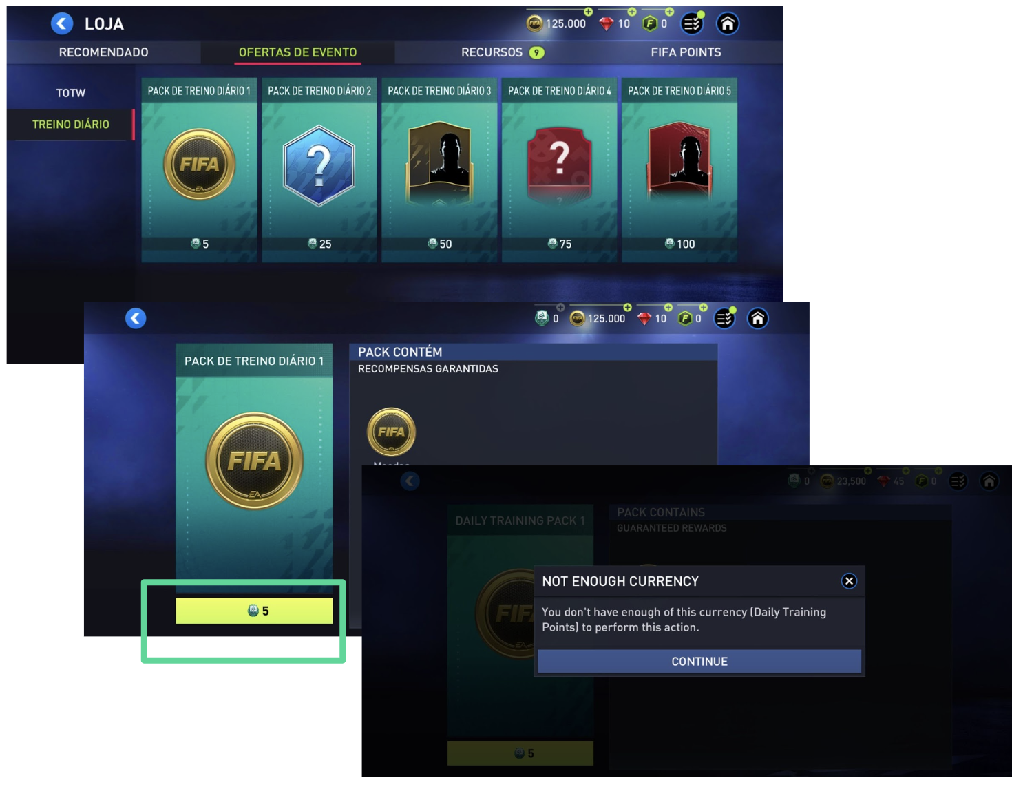
4. Sometimes, the amount is not visible immediately, forcing a click to see it.
💪 Potential solutions/recommendations
- Always show the total points on the top bar: if hidden, they should appear anytime they are referenced on the screen, especially if they impact an action.
- Disable the button as it happens in other places (e.g., when buying boosts).

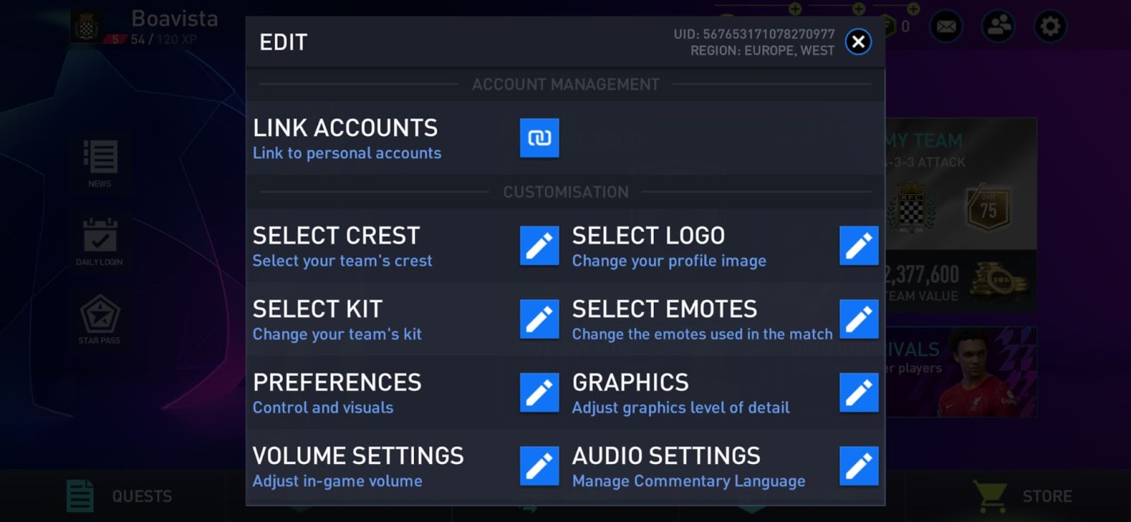
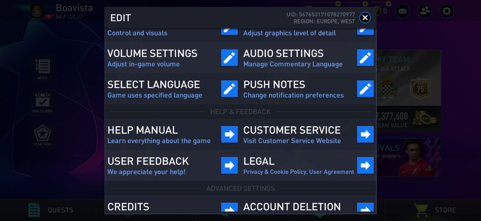
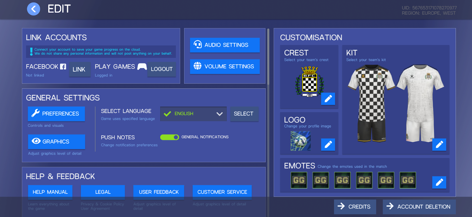
5- Edit Menu ✏️
Like I said before, football has a lot of emotions involved. I was looking at the app and noticed the Edit menu is a place where it could improve even more on a personalisation level with the added benefit of better usability and aesthetics. This menu is currently a modal with a set of options with no hierarchy.
🔎 Challenges
- The settings menu has very heavy and repetitive visuals;
- No hierarchy of the options and subheadings makes it challenging to read.
💪 Potential solutions/recommendations
- Have a page for these settings instead of a modal.
- Work on the page's graphical hierarchy and visualise some of the selected settings (e.g., kit, crest, etc.)
Final Thoughts
It is always great to have a new challenge, especially on a platform I don’t usually work with, which in this case is mobile. It forced me to be more cautious and study more about it. I was lucky that it was about a game that I knew and grew up playing that is loved by my family and friends.
The biggest challenge was understanding the feedback people were giving me. Some of them had a lot of ideas and pains that were bigger than the app itself, and others were more about the console game and online options (thanks, everyone, for being kind enough to offer me your time… and games to test). It was the first time I could select a group of testers that reflected different types of players in just a few minutes.
Since I started this analysis without an idea in mind, I had to approach it in a different way - I had too many paths to explore and a lot of information about the different issues. I organised the information and decided what topics to write about, owing to the need to focus the time and resources available to me. Ironically, it also explains why some issues like consistency and visibility are present in some of the app modes - time and scope constraints happen at all levels, even when we are just presenting the information. It’s up to us to understand what could make a better experience for our users, whatever they are, and whatever the platform.