Games UX: All About Subtitles
Exploring subtitles in games, especially when applied to multiple screen sizes


I recently completed playing through Fire Emblem: Three Houses. It’s a great game. You should play it.
There’s a lot to talk about when it comes to Three Houses. If you jump online, you’ll mostly see discussions around which member of the enormous cast is ‘most bae’. Naturally, the answer is Felix.
However, if you dig deep enough, you’ll find that there’s one element of the game that is getting a lot of backlash: the tiny, tiny text sizing.
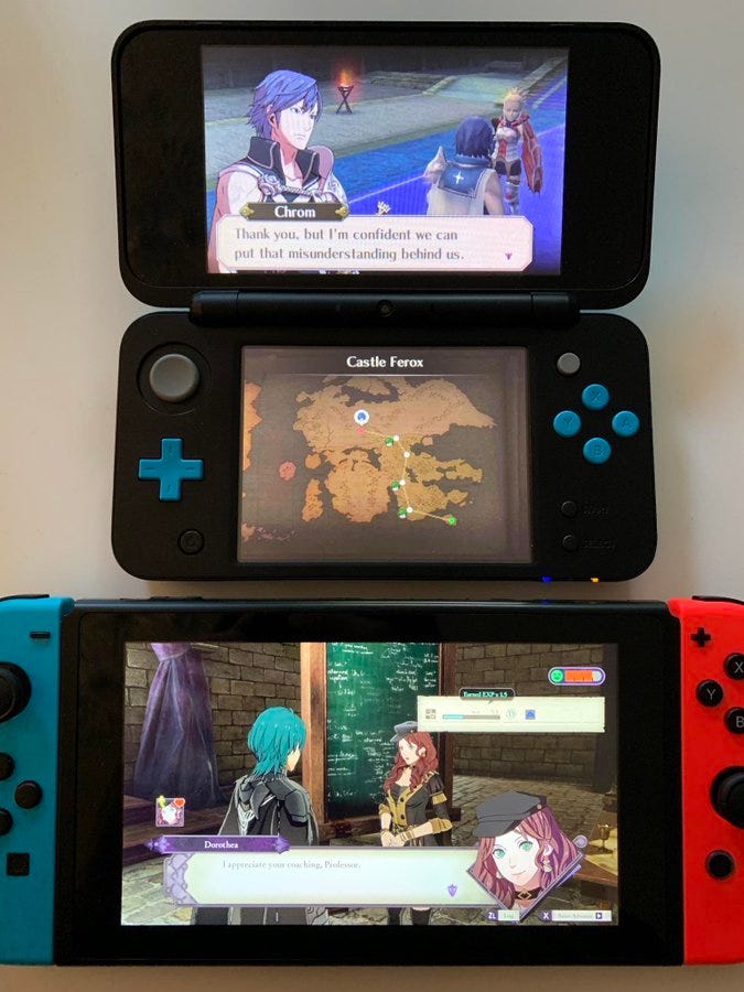
One of the best examples I’ve seen is this screenshot (left) from Twitter user @RetroFutureX (see their original tweet here), which places Three Houses side-by-side with its 2012 counterpart, Fire Emblem: Awakening.
As you can clearly see, the text in the newer Three Houses is half the size of that in Awakening. What’s worse is that there’s more text on the screen in Three Houses, so you’re not just dealing with smaller text — you’re also being asked to read more of it.
This issue isn’t just getting around on Twitter; Kotaku also wrote an article bemoaning the tiny text in hand-held mode.
What really puts this issue in perspective is when you compare the size of the text in Three Houses to the size of subtitles you’d get with a movie or TV show (Example below also from @RetroFutureX).
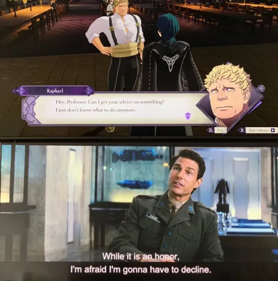
To be clear, that bottom example is not a good example of proper subtitling — the contrast is bad, so some words (‘honor’, for example) are hard to read. It’s thin text, so it’s going to be hard to read from a distance. But still, there’s a clear juxtaposition between what’s being delivered on TV and what we’re getting in video games.
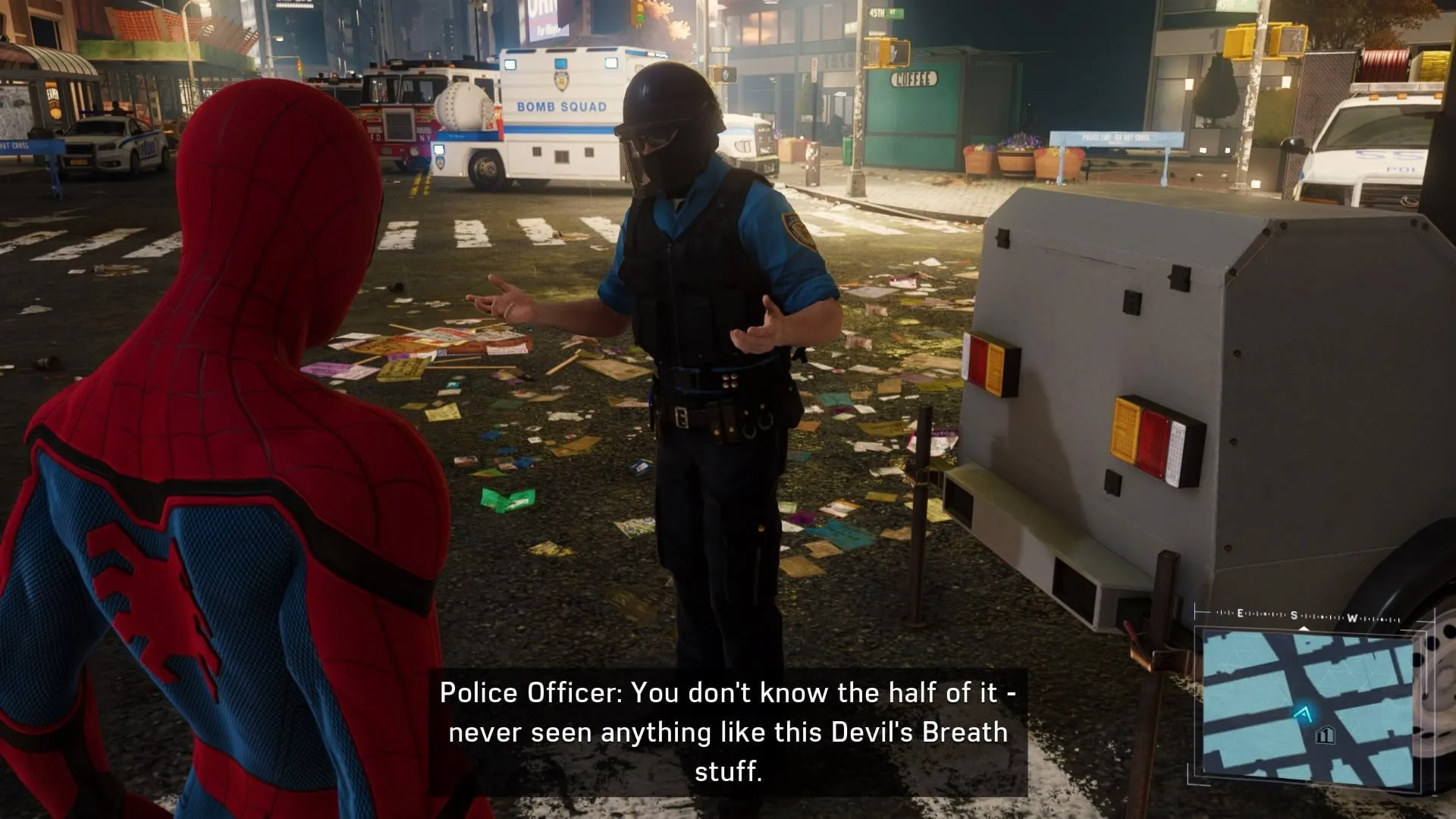
Sony’s recent Marvel’s Spider-Man is a better example of well-executed subtitles. They keep the text size sensible and put an opaque dark background behind them to keep readability intact.
My own personal experience has only ever really been in the realm of mobile or desktop apps. The or in that sentence is really important — after all, most of us have never had to design a single solution that will exist on two vastly different screens.
In fact, taking a look at this Reddit post comprising a list of Switch games with small text really proves the point; there are games from major publishers who on any other platform probably wouldn’t have this issue.
Maybe size is everything
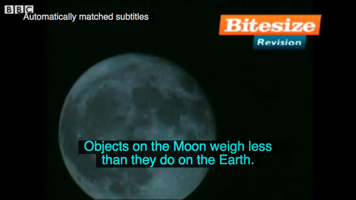
While asking (begging) my game development friends for some good resources on text sizing, I was sent this document from the BBC about subtitle sizing.
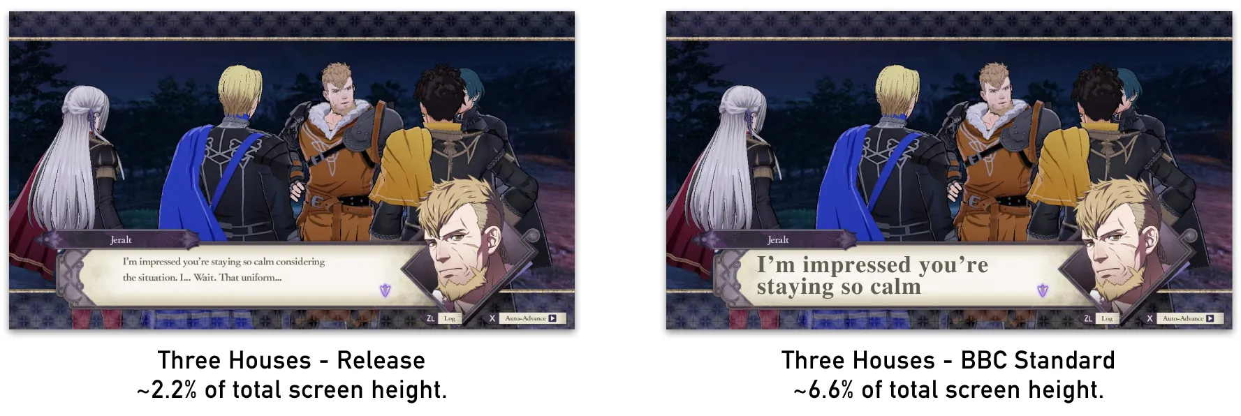
You can see an example of the BBC’s subtitling below. There’s high contrast, good text size, and it’s positioned clearly on the screen.
One of the important takeaways from this article is that the BBC doesn’t require a particular font size — rather, they require that a line of text be a minimum of 8% of the total height of the video (Three Houses is about 2.2%):
As you can see, this looks completely ridiculous (and it doesn’t help that I couldn’t get my hands on the right font). That being said, if you’re vision-impaired, this might be a huge improvement on the tiny text that Nintendo provided by default.
However, it makes sense that this BBC guideline doesn’t really work. 8% is intended for a TV that’s across the room, not a video game console in your hands. Furthermore, the guidelines state that the size should be adjusted if necessary.
Netflix is a platform that sees a large portion of its traffic on tablet and mobile, and they simply require that the text fits with 42 characters per line (you can see their guidelines here). Let’s see how this works for Fire Emblem:
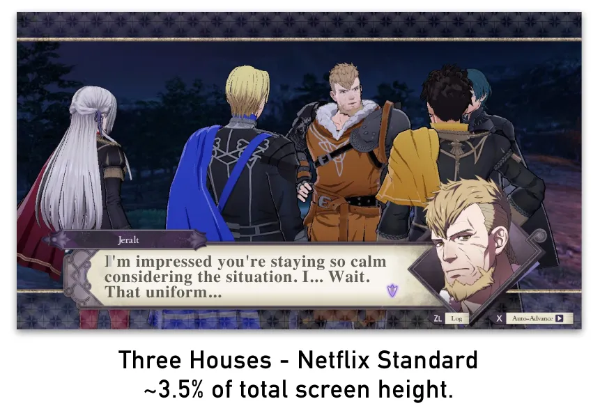
That’s genuinely pretty comfortable. With a wider text box, you’d probably be able to space everything out a little more and feel pretty good about this.
What do we want? Subtitles! When do we want them? Literally always, and with configurable settings!
Subtitles in video games
In 2015, accessibility extraordinaire Ian Hamilton put out a great article on Gamasutra about how to successfully apply subtitles to games.
In the article, Ian references a CNET poll that found 79% of players use subtitles. This poll only covers a few hundred people, but it tallies with the misconception's broader real usage data. For example, Ubisoft reported that in Assassin’s Creed: Origins, although subtitles are off by default, 60% of players chose to turn them on. In Assassin’s Creed: Odyssey, subtitles are turned on by default, and 95% of players chose to leave them on.
With that sort of ratio, it’s pretty clear that this isn’t just an accessibility feature.
It makes you wonder why, in almost five years, we are still getting AAA releases with poorly executed subtitles. The Legend of Spyro Remastered released last year with no subtitles. FIFA, one of the most popular games on the planet, doesn’t have subtitles for its commentary.
Ian’s article lays out several major recommended components for effective, usable subtitles:
- High contrast between text and background.
- Avoid presenting too much text onscreen at one time.
- Use a large enough text size.
He also puts forward a number of additional, non-critical recommendations that I won’t mention here. Ian has continued to champion an evolving view of subtitles in games, and the way they should be applied. More recently, Ian presented a talk at GDC 2019 where he discussed subtitles in great detail — including the various use cases that should be considered, and the numerous scenarios that developers need to take into account (he also recommends checking out the BBC guidelines, too).
Given this context, let’s see what we can come up with:
The wider text area means we can accommodate some wider spacing and bolder font choices. I’ve also center-aligned the text, as both the subtitle reference documents we looked at earlier have that as a recommendation for readability.
The main strength of this approach, however, is flexibility. Because the text box is a little bit larger, and could theoretically scale in height, we can customize it to suit both the TV and portable modes:
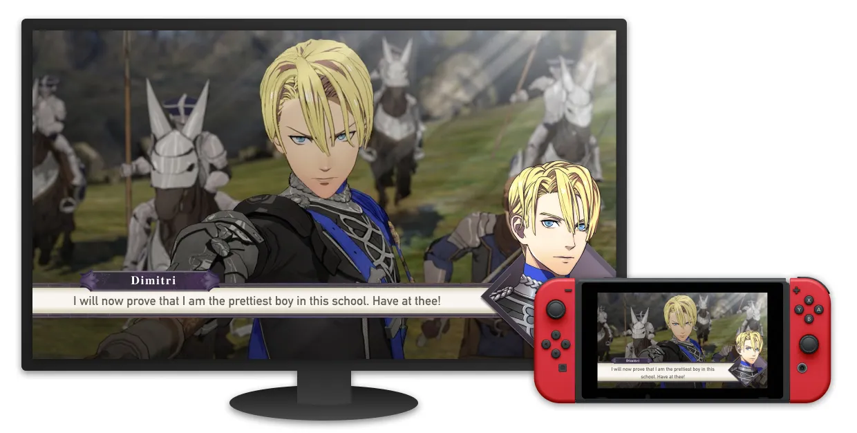
As you can see, the text scaling changes in hand-held mode to accommodate the idea that you’re closer to the screen, and have a little less real estate.
As I was doing research for this piece, I talked to Ian about what other aspects game developers need to consider when it comes to treating text on the screen. He had the following to say (emphasis mine):
But there’s a massive caveat in that any single size is going to be the wrong one for someone, way too small for some people or way too big for others, because people’s visual acuity is so varied. Those sizes above are based on someone with full 20/20 vision, doesn’t take into account vision impairment, varying screen sizes and viewing distances etc… So actually the only “correct” text size is a configurable one.
The industry in general needs to move to user-scaleable UI. There’s also now a legal imperative for it, all games with voice or text chat functionality are required by law to ensure that functionality and any info & UI needed to locate, navigate to and operate the chat functionality works for people with 20/200 vision, which is the cut-off for legal blindness. The only realistic way to meet those needs and legal requirements while meeting preferences of people with 20/20 vision is to have scaleable UI.
If you take away one thing from this article, it’s that scalable, customizable UI is the way of the future. Gamers are an enormous, diverse group. You might have memory issues or cognitive issues that having the text there helps dramatically, and as we’re seeing with the number of players using subtitles, most players, in general, want better subtitles
Scalable UI isn’t just about text either — iconography, health bars, mini-maps, menu items, equipment icons — the list goes on and on. The more flexible our UI’s are, the better they’ll suit everyone.
As I was writing this, I started playing Control from Remedy Games. When I first started the game, I jumped into the options menu to adjust my display settings and audio, and, as I do with most games, turn on subtitles.
I was pleasantly surprised to find a wealth of subtitle options available:
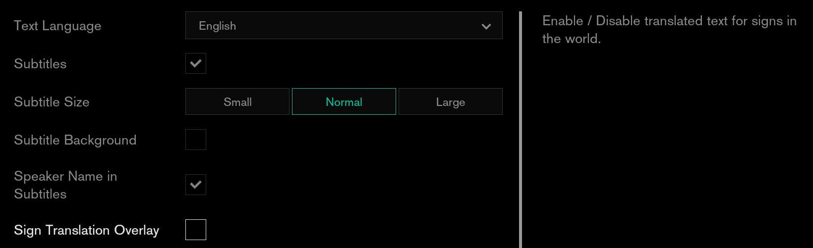
So much of what I’ve just discussed is available here, such as controlling the font size or if it’s displayed on a darker background. There’s even an option to bring up text overlays when you’re looking at signs in the game, so you can see what they say without having to physically move close to them.
It’s worth pointing out that there’s still a minor misstep with Control, however. The player is asked if they want subtitles when they start a new game, but they’re not asked about text size or adding a background. For this reason, many players might watch the opening cinematic without readable text.
It’s fantastic to see this, but it also makes it so apparent how far behind other games are. Hopefully, games like Control taking usability is a sign that we’re finally moving forward.

Join the conversation
What do you think? Reply below to share your perspective.