How Games Can Give Insights and Solutions to UX Problems
Anything you love can teach you lessons that apply to your work

I’ve been working as a UX designer since 2019. So far, I’ve mainly worked for Back Office tools: energy and water management, inventory, catalogue, logistics, etc. I focused on my UX job and learning and reading outside work.
That said, I never stopped gaming - it’s my way of relaxing, and in its magic, it keeps me going when motivation is running low or life seems too grey to smile.
I naturally write about the intersection between these two big things in my life, and it’s no secret I want to learn more and even bring it to my daily job. I was looking at games through the lenses of a UX designer… and noticed that games also touched my work in a subtle and fun way.
Let’s see some good examples. The first two are solutions I used from games, and the rest are some of my favourite learnings in design that were glued to my brain by games.
Using Specific Solutions From Games
These two are solutions that I used because I remember them from games. It happens more often, but these are the ones I sometimes talk about and that always make me smile.

Read it like in Cyberpunk 2077
I was working on a sandbox learning website for the UK's energy sector - teaching how to communicate between devices and various systems. Communications of this network (that connects the entire country) must be incredibly safe and secure. Consequently, the complexity level to handle it is high, which means that the learning curve to operate in the systems is also increased and prolonged. To decrease the learning curve, my company was challenged with creating a learning space for new users of this massive network. We decided to create a safe space not only to learn but to experiment with a simulation of the fundamental things.
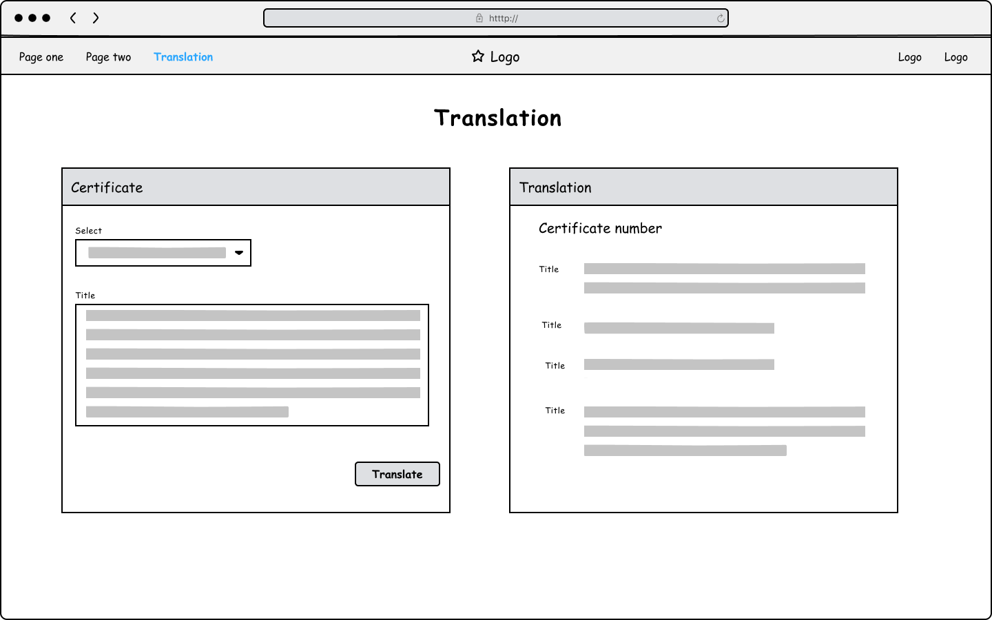
One of the pages of the learning tool should allow translation of a security language protocol so that users would get used to it. Users should be able to learn how to “read” essential information without the need for this translation tool.
So the solution was to have a space to translate it and compare the two languages: the protocol and English. I also wanted the user to compare parts so it would be easier to scan and read them by themselves.
When I was thinking about this challenge, I immediately remembered Cyberpunk 2077. I was playing it at the time and compared it with how I had just “cracked the security” of a Military Datashard.
When a player gets a Military Datashard, it’s necessary to crack security to read it. Otherwise, it is just a random set of numbers (first picture below). To crack it, a Breach Protocol hacking puzzle is opened (second image): on the left side, you can see the code matrix and the sequence required to upload on the right side. While the user clicks on the code matrix options - on both sides, the choice is highlighted with a blue square and blue text (third image). If the code is cracked, the shard is now readable text in a known language (fourth image in English).
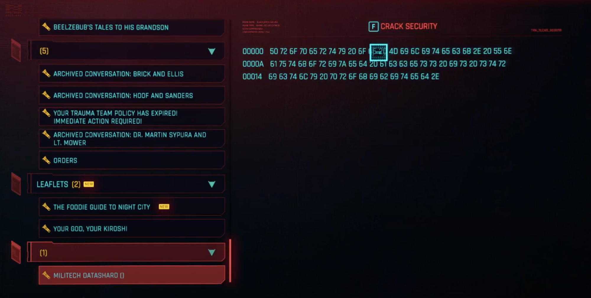
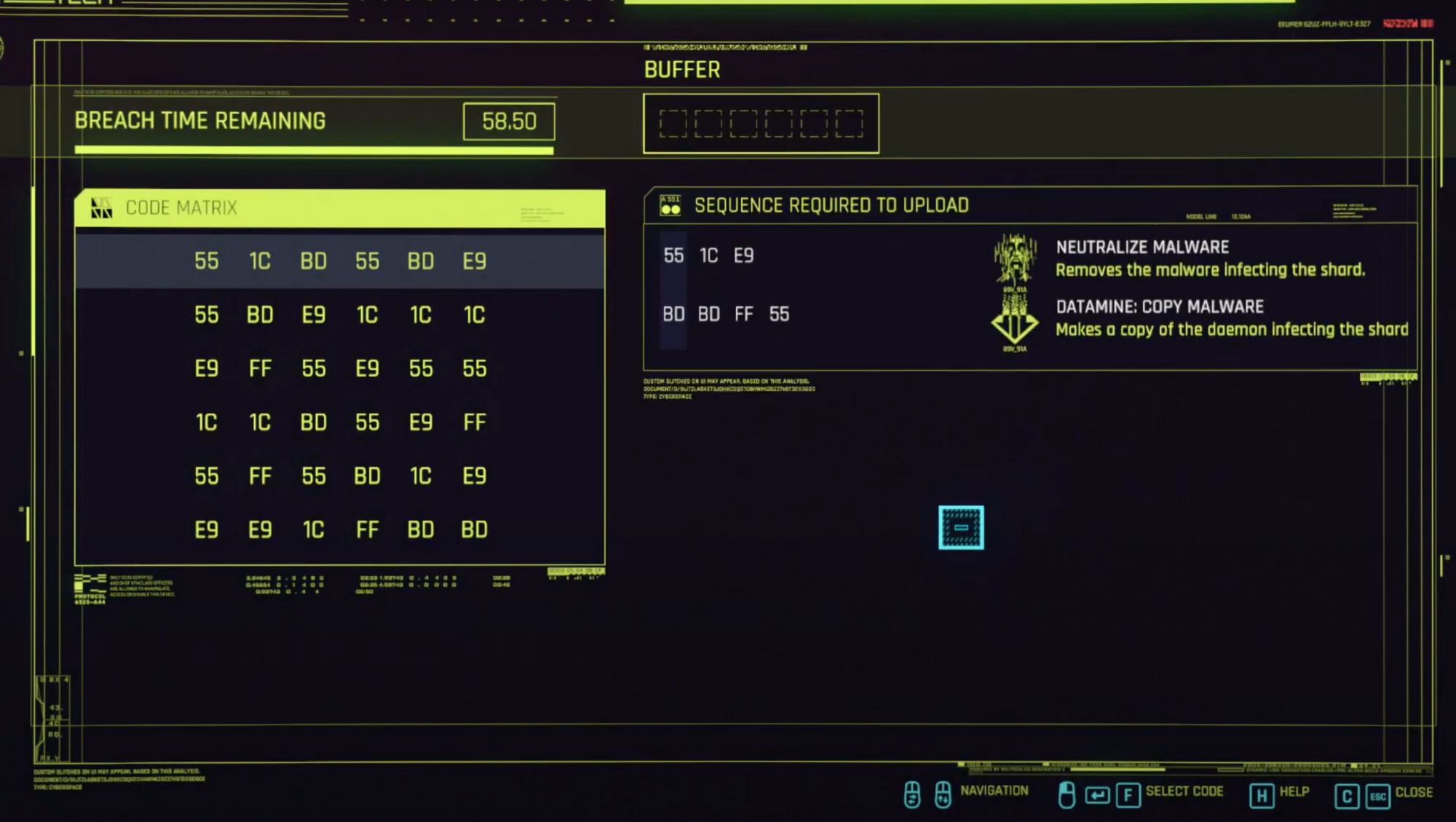
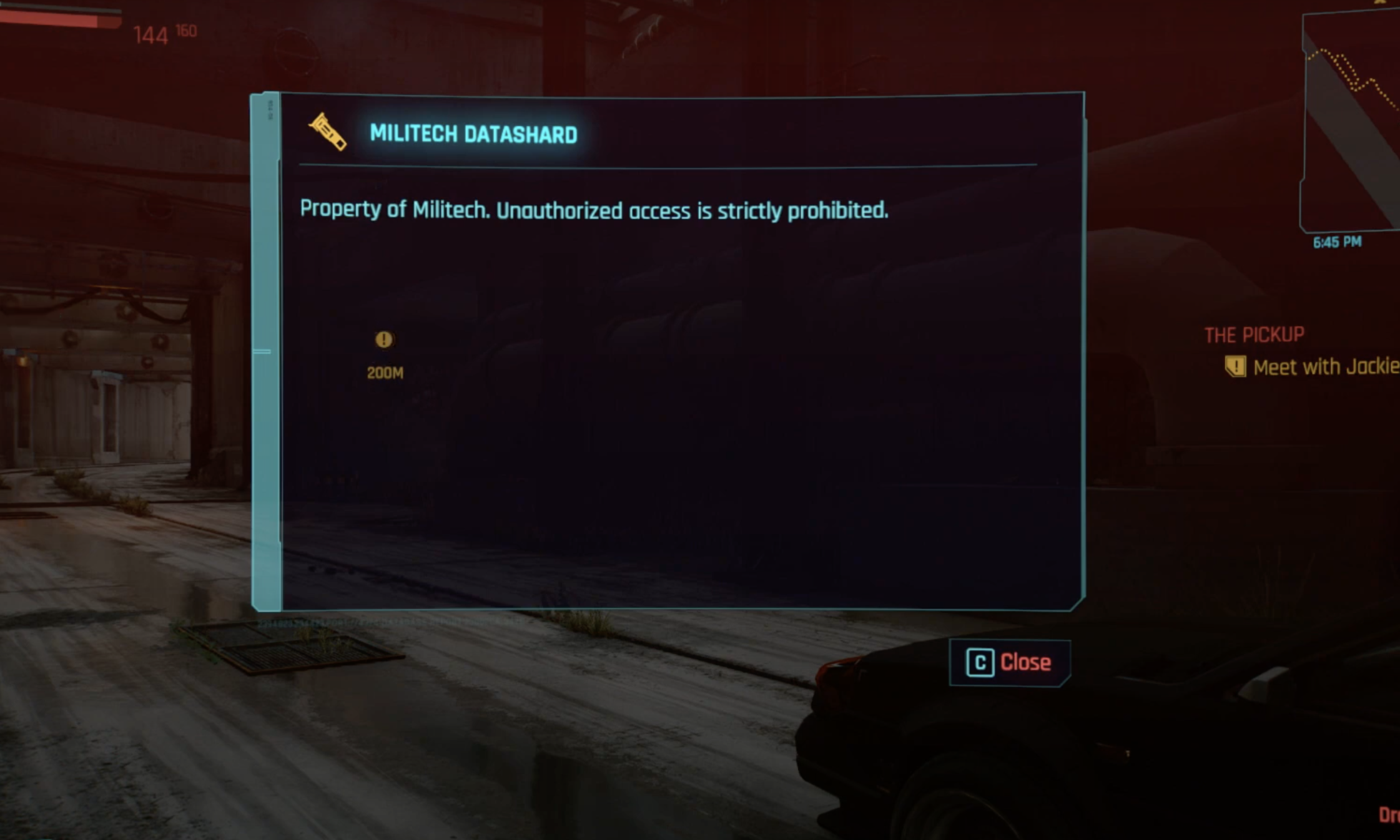
All images courtesy of Author.
I took some of these ideas and applied them to my challenge.
I used the logic of separating the screen into two. On the left side is the protocol language and on the right side is the translation. It also follows the order of the action - past the protocol on the left and clicks to translate it, showing the translation on the right - following most countries' reading standards from left to right.
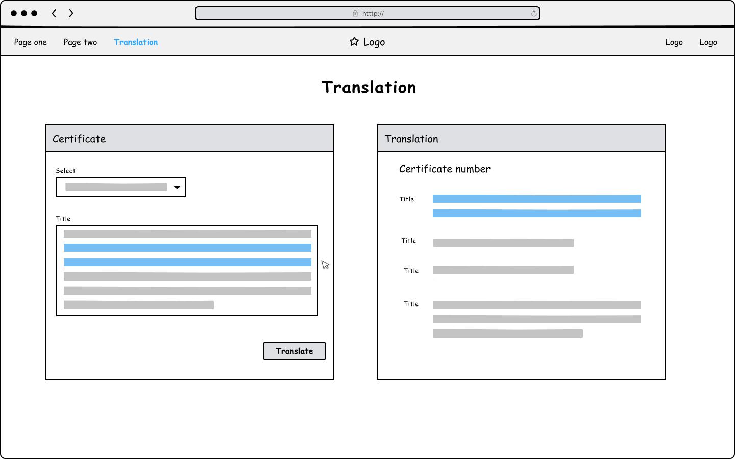
I used the highlighted code selected, and its impact is also highlighted on the right. The idea was to make it easier to read specific parts of information (the most important ones) to make it easier to memorise.
Yes, I stopped users with a prominent stop sign
A technical constraint was noticed during development. It could result in an undesirable error; finding the ideal solution was hard, and the project had to go live soon.
I knew the technical solution would arrive soon, but something had to be done; otherwise, the task that users had to perform would fail right at the last moment because of something that failed at the beginning of it. Or worse, users would only notice the error after leaving the application. This could cause enormous frustration because this task takes some time to perform.
I remembered those obvious signs stopping the playable character from exploring some parts of the environment. Especially the ones that are not from the game world, like those literal stop signs from the Yakuza and Judgment series.
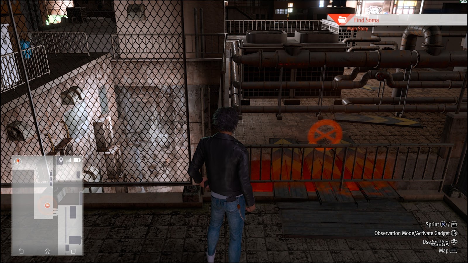
I’ve been using labels with information inside tooltips as an equivalent for these band-aids in the system. They are visually evident and impossible to miss.
I try to smooth things down a bit and disable the actions buttons as soon as possible in the task - but it all comes down to the scope and time the developers and I have to work with.
I always keep an eye on this small signalisation that can be taken down when the problem is solved - we shouldn’t need them, to begin with.
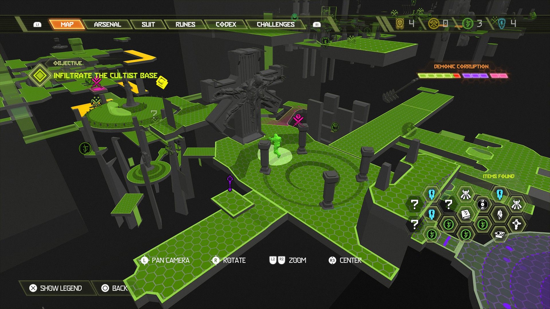
Dealing with complexity, with games in mind
Working in the back office can sometimes be challenging. Users might use just one tool to perform different tasks. Users with different roles and goals might be using the same tool. We try to decide the hierarchy of actions or information - trying to understand what is vital or critical to their jobs and what could have more impact in different places.
There is also a lot of interdependency between tasks - some might prevent or allow others, and it is constantly growing and improving.
There is a fight for space and hierarchy that is constantly being fought.
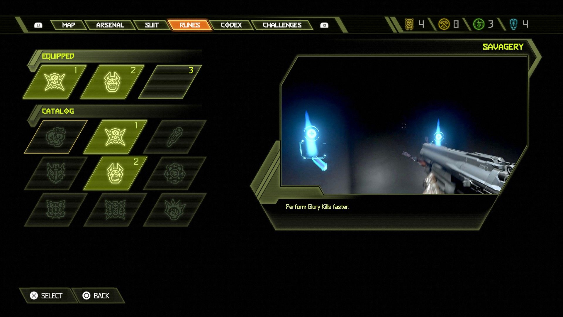
Work the action hierarchy
Some video games have highly complicated menus, but others have them neatly organised. Some have too many options to improve, others have a lot of visual imbalance, or it’s hard to navigate in a UI with different components and connections, trying to fit everything on a single screen. There is a lot of stuff to manage, and you can get lost in a lot of information and potential actions.
Doom Eternal and Spiderman: Miles Morales are two very different games, but I think they have in common menus that are manageable. They manage two things smoothly:
- Slowly unblock (and unfold) actions and information;
- Components are broken from a single principal one to a tree of potential information/actions below it in a smooth and collapsable way.
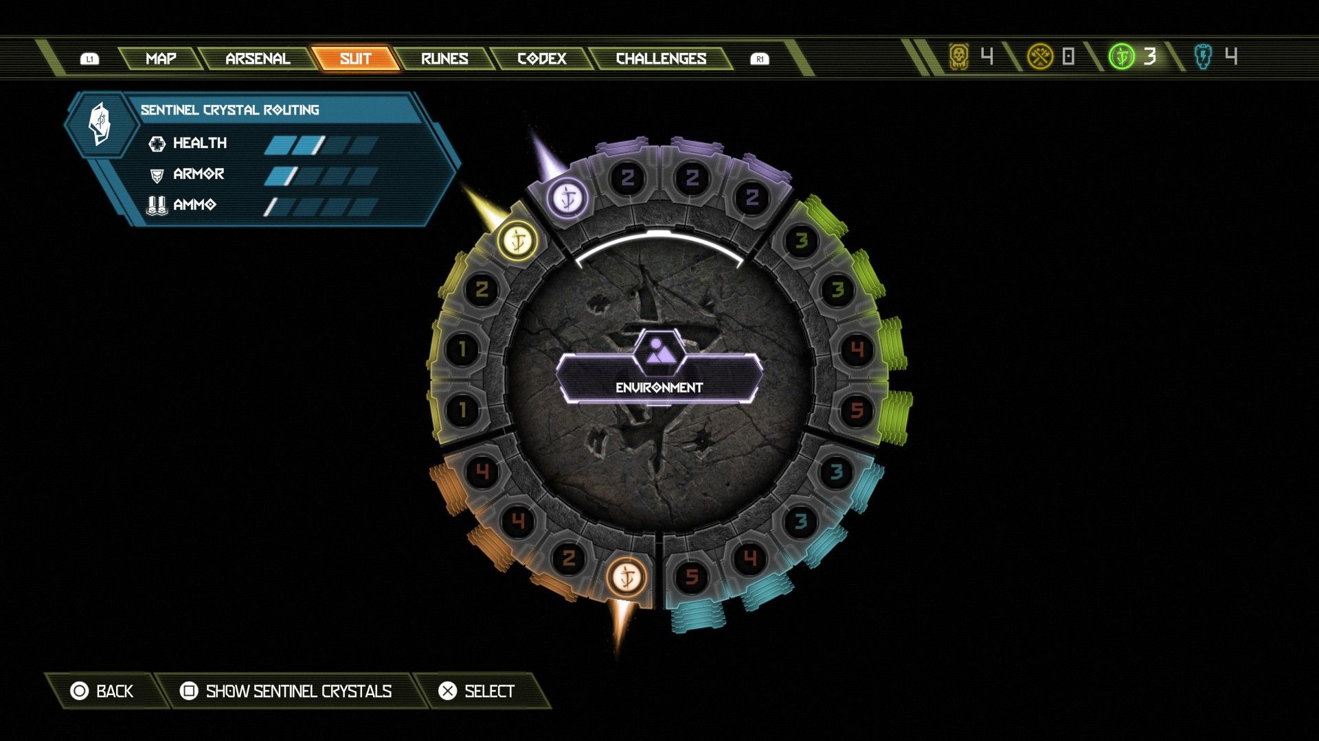
The menu inside Doom Eternal - each page has its own visual organisation. Source: Author.
Each section has its own visual organisation that allows the user to quickly learn how to differentiate between them without losing the sense of being in the same menu. Each section can be broken into smaller pieces that can have even more ramifications - it could be messy, but they are all organised from the most fundamental component/concept to the most hard-to-get and detailed one.
The most critical and used actions/information are always on the first level of the screen, and the optional or more exploratory ones are on the lower levels.
It’s also tied up with the idea that we should have flexible and efficient systems adapted to different experience levels.
I try to keep them in mind - study the data and concept map well. Try to understand what is crucial and needs to be accessible anytime.
I consider how different actions (like add single, add bulk, edit, view) can have distinct but easily identifiable pages and what can be folded inside each main action.
How can we keep consistency in a tool but have different page organisation according to the core action? It’s something that I always keep an eye on when I’m playing games.
Make it visible even if it’s temporarily unavailable, but tell users why
If the user's role allows an action or sub-action to be performed, it’s visible even if something else is disabling it. If it does not - the action is not visible on the screen.
I’m always careful with the visibility of an action that can’t be performed - is it clear why the button is disabled? So I took a bit of Mass Effect in here. In the first game, your Charm or Intimidate points would determine if you could select a more diplomatic dialogue option or an aggressive one.
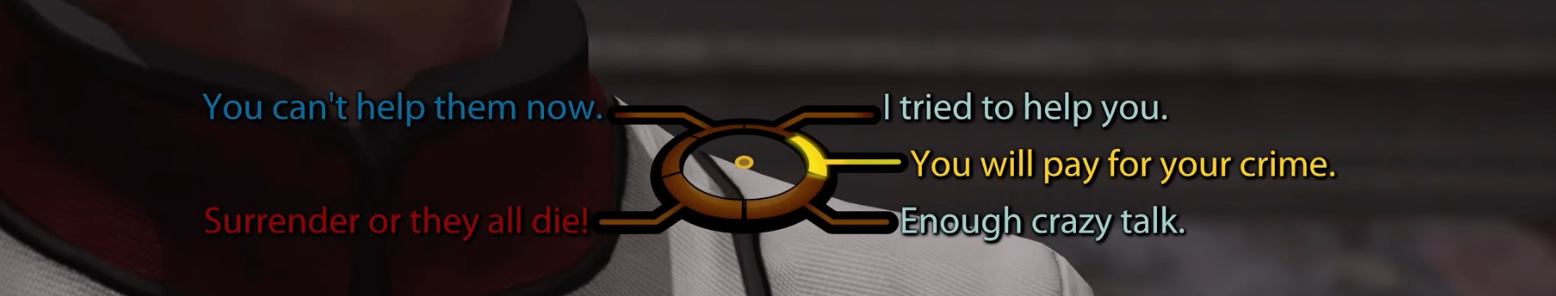
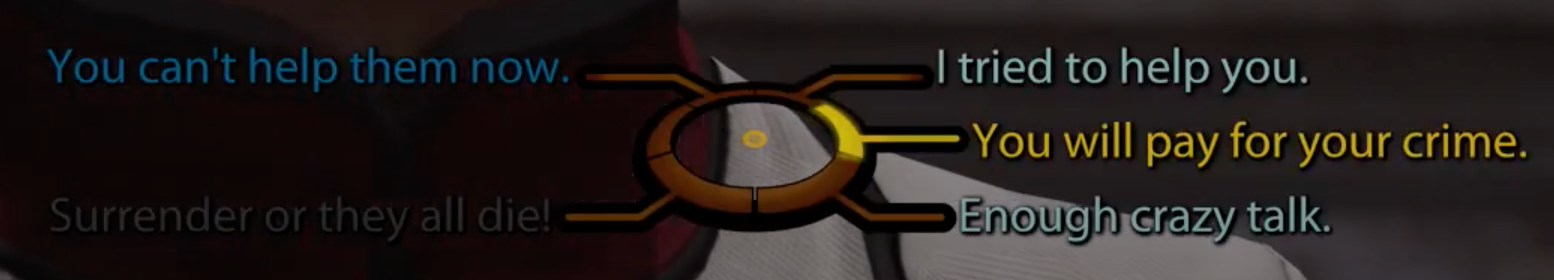
On the first image, the Renegade option is available. On the second image, the Renegade option is disabled but still visible. The placement of different moral options on the dialogue wheel is always the same during the game - the player knows if it's violent or peaceful even if an option it's greyed out. Source: Author.
If you take the Paragon path, your Charm points grow, and you might end up with a dialogue with the Charm option always available but not the intimidating one - you cannot insult or coerce people. But the choice is still there (disabled) with the amount of Intimidate points you need to unlock. It does not mean that you need to have Intimidate points or you want to. The game gives you that information to make your own decisions - to stay on the Paragon path with Charm points so you can select friendly dialogue options or change your game a bit to have the Intimidate options also available. It’s your path.
Different roles, different views
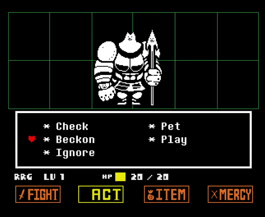
As I said, you can have different users in the same tool. Some might need more complex information, and others just require minimal visibility and actions. I like to think about Undertale and how the Encounter and Attack menus are adapted to the different enemies. They have the same four main actions, but the options might vary inside. I always try to look out for this logic - understand how to adapt to the different roles. It requires care for the minor information and actions available inside the main ones. How can an action be broken into smaller ones to be adaptable? How can a table be set to adapt to the different amounts of information per role?
I try to look at each role like they have different personalities - they can even have various tasks and goals.
Warn and prevent the users from doing an action as early as possible
This is a personal pet peeve of mine from the Yakuza and Judgment series - in some menus, especially when buying items or food/alcohol, you are warned very late in the task that you can’t buy that item/food.
It has improved over time, and in the last game, Lost Judgment, you at least have the items/food visibly disabled. But if you do not have money or can’t eat/drink anything, you can still open the menu and click to try to buy/eat, and only after that do you have information that you can’t do it and why. It’s more frustrating in menus where you must scroll to see all items.
It’s a complex thing, and in this case, it has a lot of reasons not to be able to get that item/food/alcohol: it can be that you have no money, that you are drunk and can’t drink more, that your stomach has a limit, or that you already have the max capacity of the item.
It requires some logic behind it, and simultaneously you want to give users the most complete information you can - if they already bought that item before, the price if they're going to buy it in the future, the amount held, etc.
Given the frustrating number of times I have found a stop sign too far away on the road, I always try to keep my eyes open to what I can do about this in my work. Most tasks take time - not only because they demand time from the user but because they demand a lot from our systems. I don’t want to add to the frustration and warn people too late in the process that they can’t do something or should have some information or perform some action to unlock a step on the task.
As a UX Designer, it can be hard to be aware of all the data, technical dependencies, and potential errors that impact the task to have a clear picture of the complete flow. I’ve been consistently working on improving the representation of user flows and sense-checking them with Product Managers and Engineers.
It’s rewarding and hilarious to hear my colleagues talk about this without knowing how I assimilated this idea. I have this issue glued to my brain because every time I was drunk (in Yakuza games, of course) and wanted to get a drink in the Earth Angel pub, I would open the menu and click on a drink only to have Ako tell me that I had to sober up first.
Design for not tech-savvy users with experts in mind
Mario Kart is my family holiday game. We play it during Christmas and take the Switch with us during summer break. As you can imagine, we have very different types of players: people that train during the year to beat everyone; people that focus way too much on the karts; people who select karts and characters based on mood or which is the cutest; and people that say they don’t want to play but end up being too invested in winning after just 5 minutes.
Some play games on a weekly/daily basis; others only play Mario Kart with the family; some play console and PC games, others mobile ones or just sudoku on paper.
Generations, jobs, and experiences are also very different - we have the chaotic competition nature in common, not to win, just to make everyone angry. I guess it runs in the family…
I notice that teaching anyone how to play it is effortless.
- The controls are simple, and we tend to teach more complex actions as people master the simple ones. Slowly everyone learns how to drift, start with a boost, and pick and use items.
- The menu is folded in a hierarchical way that is logical and makes it simple to understand how to create a competition and a character - the only question people have is about the engine class.
- The HUD during the game is straightforward and reduced to only the necessary info.
- The items are fair to the position inside the game - none of us thinks it’s too harsh for technically good players. It feels like the difficulty is adapted to the challenge we want to have with the possibility of playing with family members who are not so good technically! It isn’t something we can do with them in most of our favourite games (people that play games more often).
If you look at Mario Kart, it seems easy and adapted to the entire family, but there are a lot of tricks and technical challenges you can overcome if you are good at it. Something as simple as selecting a character or kart that is not adapted to your style of play can be a challenge.
It’s my favourite game to remember when I’m talking about users. In my current job, we have people who barely use a computer and tech-savvy people who are experts in our tools. They even know more about them than us - they found the tricks and small accelerators and know them by heart, things that teams of product and engineer people built over time.
I was recently working on an editable table for stock. It needed to be organised by sizes inside locations and another level of storage inside it, varying on the type of stock. I used the “different roles, different views” to adapt this complexity to the different roles. Still, I also had to think about the various tech knowledge, even in roles with more information.
The visibility needs to be clear, and so does the edit action. The table is built with cells with a simple number input to add numbers: you can go there, click with the mouse and add a number; you can just use the keyboard.
It’s good to keep in mind the less tech-savvy users when designing the first actions, the visibility, and the hierarchy of information. However, we also need to keep an eye on adding accelerators and tailored content for experienced users.
Final thoughts
Whatever our job is, I like to think that our passions and learnings outside of it can give us joy and keep us motivated.
If we like what we do, it can inform our decisions and help our passions. I have colleagues who optimise how they bake or make their house more accessible for loved ones with challenges using design principles and skills from their daily jobs. But it can also happen the other way around - people that use storytelling skills from playing D&D, people that love music and use it to relax during the day and help with stress, and people that use resilience and motivation techniques from playing sports.
As a Designer, I like to see how different solutions to problems can be abstracted to other contexts - it’s natural that I started to look at games from the UX lens and that games also would be present in my daily job. I found solutions and assimilated knowledge through games.
If we take our passions to our daily job, even if it’s just inside our heads, we can keep a spark of fun and happiness during the most challenging days.
Comments
Sign in or become a SUPERJUMP member to join the conversation.