How UX Breaks the Fourth Wall to Make Better Video Games
Exploring the role of UX in video games


For the majority of its existence, the video game industry has solely focused on video games. What started as simple Pong slowly evolved into creating larger and larger spectacles. The bloody rampages of Doom and Wolfenstein, the open worlds of Grand Theft Auto and The Elder Scrolls, the sprawling set pieces of Call of Duty and Halo, and high concept indies like The Witness, we’ve all seen the many directions in which the medium has expanded. The focus was solely on creating video games that were engaging, that pushed the boundaries of play.
But with the progression of the craft, and more importantly of consumer needs, the industry has started looking at things inside and outside video games that don’t always have everything to do with the gameplay. The first split away from video games was a focus on marketing, as is for any product. Eventually, the focus started splitting to other things, including platform, collateral channels, communities, and user experience. Pushing tech, art, and game design to innovate methods of play are not the only focus anymore.
Gameplay will continue being the most important thing for video games, but why are all these other things becoming more important? While marketing and acquisition have a big role in how many players are involved, platforms and user experience are important for how many players continue to stay. With the evolution of the industry, retaining players and continually engaging them has become a more sustainable business plan over one-shot releases and never being heard of again.
The role of UX design in video games — what are we even supposed to do
It is quite easy to mistake UX design with UI design or simplify the idea of a UX designer as someone who makes sitemaps, user flows, and wireframes. While these all should be the toolset of a UX designer, being a UX designer is about making decisions. The most core decisions will involve the amount and rate at which UX will help or break the game design. The next set of decisions will involve choosing the most impactful ways to make the game accessible to more people (a splendid trend that will gain further importance). The rest may follow in order of priorities for the project, mostly related to the platform, ecosystems, and collaterals that players use when playing the games.
Make or break the game design — choosing to dispel illusions
It is very popular to say “form follows function”, but it is crucial to remember what the actual function is and how much each function means to each player.

It’s a critical decision to nominate a way to dispense information or relay instructions that take into consideration not only the cognitive load on a player’s mind but also the level of immersion that has already been achieved. This will rely on many things including existing mental models, popular trends, and how game elements have changed throughout the years.
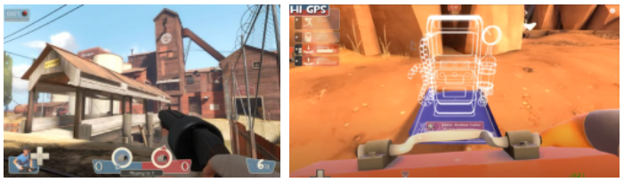
Which fulfils its functions best? Which has the most appealing form? Source: Author.
These 3 games have spanned over decades, encompassing not only the journey of technology but also of game design and design intent. The very understanding of form and expectations of function have changed, yet large parts of the arrangements and elements have remained unchanged.
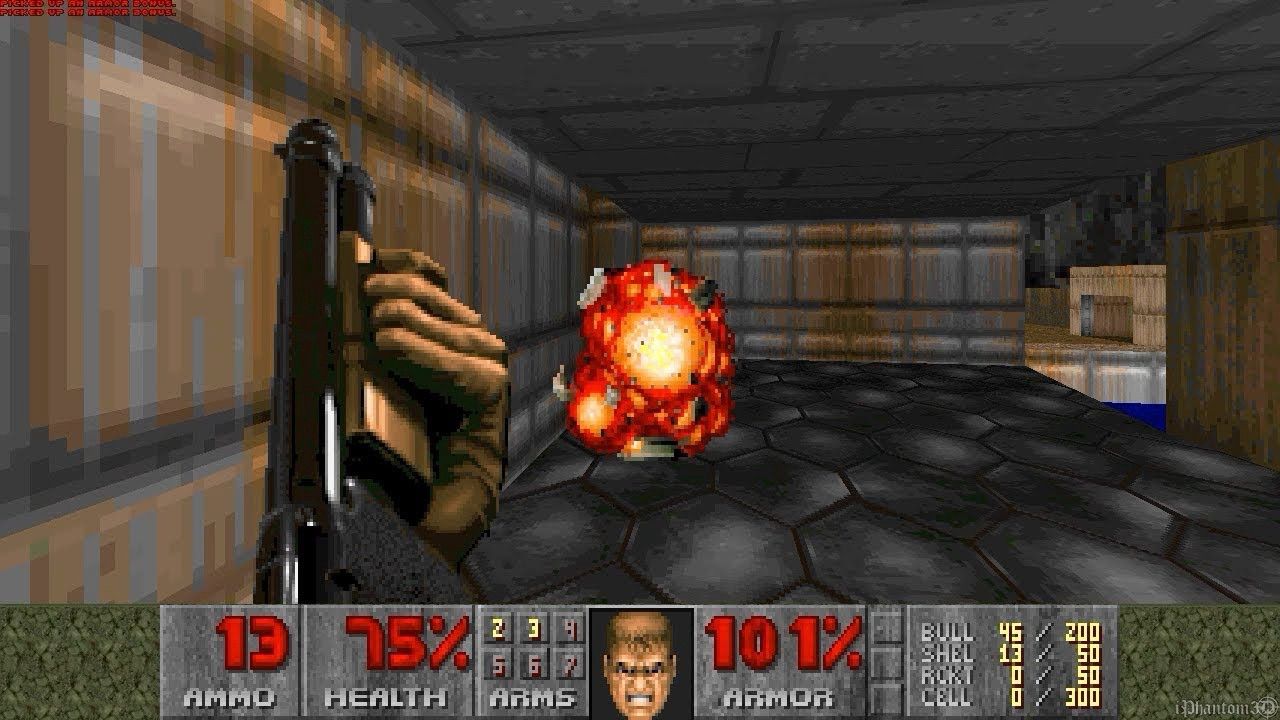
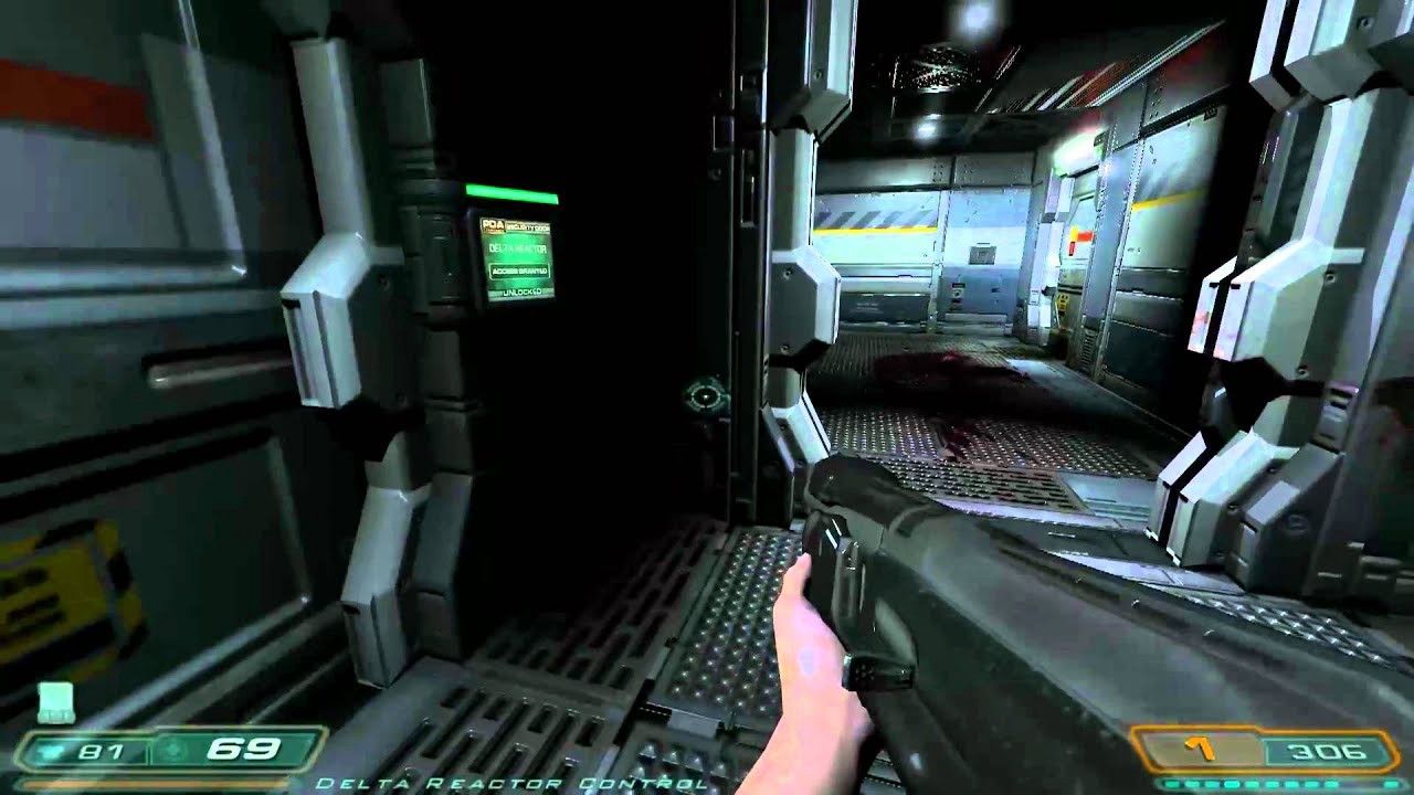
Try not to touch the wall (Doom 3)
Doom 3 is a game that relies heavily on its atmosphere and setting, and therefore wants the players to look at the world as much as possible. Hence many elements like ammo counters are on the guns itself. The UI tries it’s best to not break the 4th wall between a player and the game world.
Another game that does this is (the most famous example) Dead Space 1. Everything being in the world is simply a request to the player to keep looking at it, rather than breaking the illusion.

But on a maximum form to maximum function scale, both these examples would lean heavily towards form. Is the health bar from Dead Space 1 the fastest and clearest way to dispense the information? Probably not. The same can be said of Doom 3’s ammo counter. Elements inside the world also suffer from real physical problems — being obscured by light or other objects, being hard to focus on due to motion, being difficult to perceive. But all this helps lend to the intended effect, they make the player focus on the world.
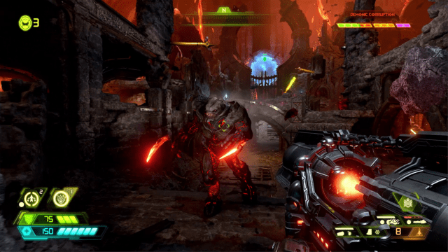
Break the wall slightly more (Doom Eternal)
For Doom Eternal, all focus is on its action and carnage. The pace is as hellish as its setting. To facilitate absolute, unadulterated thrill, the game does not try to make you focus too much on the world. The information is easier to digest, simpler to perceive.
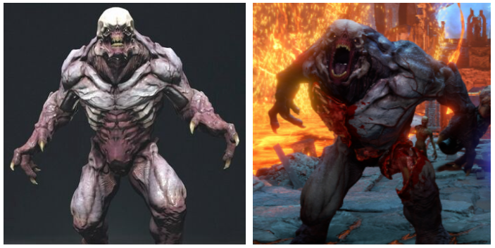
Doom Eternal has a clear demarcation. Everything related to the Doom Slayer (the player) is non-diegetic UI that clearly indicates everything including ammo, health, status, etc. Whereas everything that is related to enemies, their health and status, is a part of the world. Glory kill indicators flash inside the 3D world of the game and instead of health bars, part of enemies’ flesh literally falls off. This information is still very much a part of the world.

A follow-up example for this approach would be Team Fortress 2, where anything goes. As a mixture of multiple ways to dispense information and lacking any strict ruleset, TF2 is a great example of finding a balance between using the flat interface and using the game world.
For a class such as engineer, information is all around the place. Health and ammo of the player? Bottom left. Health and ammo of building? Top left. Orientation and locations of the building? In the game world. Spy sapping my sentry? Beep beep. What’s that burning smell? Our PCs from rendering 5000 Unusual effects. It would be safe to assume that like a museum, TF2’s user experience tickles multiple senses. Multiple compasses, multiple fill bars, multiple objectives (in the game world or otherwise) showcases how elements can reside in multiple spaces at the same time with no coherent rules to dictate whether or not they belong there, yet also showcases that it can all work.
I came in like a wrecking ball (Doom 1993)
Probably the video game with the most reach, a piece of software that can run on anything including refrigerators and microwaves. It was revolutionary for its age and still continues to thrive and inspire. Without the established science of UX back in its day, it relied on what the Doom Marine is known for — getting things done. For Doom, there was no science. If it works, it goes in.

If Doom wants to tell you something, it tells you. Even the layout (for the original aspect ratio it played on), did not care much for form. It was permanently stuck in one place and showed the same variables no matter the context. From a UI perspective, not much has changed in Doom Eternal since they both have permanently affixed HUDs. But while some elements in Eternal were well off being in the world, Doom had only so much to offer mechanically and hence all of it is in this super functional interface (including hard mapped controls!). The game’s UI took no liberty in hiding the fact that it was indeed a video game with its numbers and percentages.
So, what’s a UX designer supposed to decide?
The core decisions will involve how much of the 4th wall each element in the core loop will break. This will be done through very close collaboration with game designers.
If dialogue is important, then subtitles must be considered with respect to how much immersion the player might be experiencing and what the design intent is. Let us consider some examples.
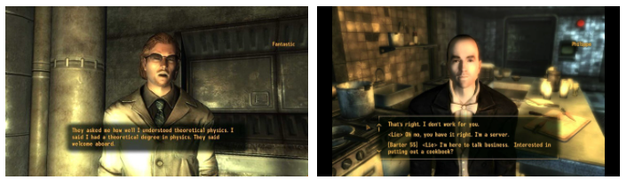
Subtitles for conversation dialogue is very invasive in RPG games like Fallout, almost stopping the game. Yet it is a part of the core loop and heavily reliant on stats, so the game doesn’t pull any punches when it wants to tell the player which stat they are referring to when selecting a dialogue. It also includes the nature of the dialogue (lie, truth, question, etc.) to better inform the player what exactly to expect in the follow-up line.

Meanwhile, subtitles in an action-packed game are barely present. While font readability and text speed are common accessibility functions now, their job is no more than to transcribe audio. There are no annotations, there is no call to focus. It intends to never invade the game space, especially if it were to happen during the action.
But for a game like What Remains of Edith Finch, subtitles are more than simple accompanying text for audio. It has an almost physical presence, attached to the object that triggers the thought and monologue in the player-character. The subtitle is an anchor, drawing the player’s eyes and leading them through the game space despite clearly not being a part of the 3D game world. Whatever annotations and callouts are needed or emotions are done via animation and motion of text.
Each of these examples showcases unique functions, and the elements have a specific form that adheres to the function. It is up to the UX designers and game designers to decide exactly how much invasion there is. These are all elements that break the 4th wall, but they all do it for varyingly different purposes which change their form.
Invasion of game space, invasion of player’s mind
When deciding the inclusion of a component, it is advisable to understand what exactly is the design intent. Very few mechanics are in a silo, and none have the same importance.
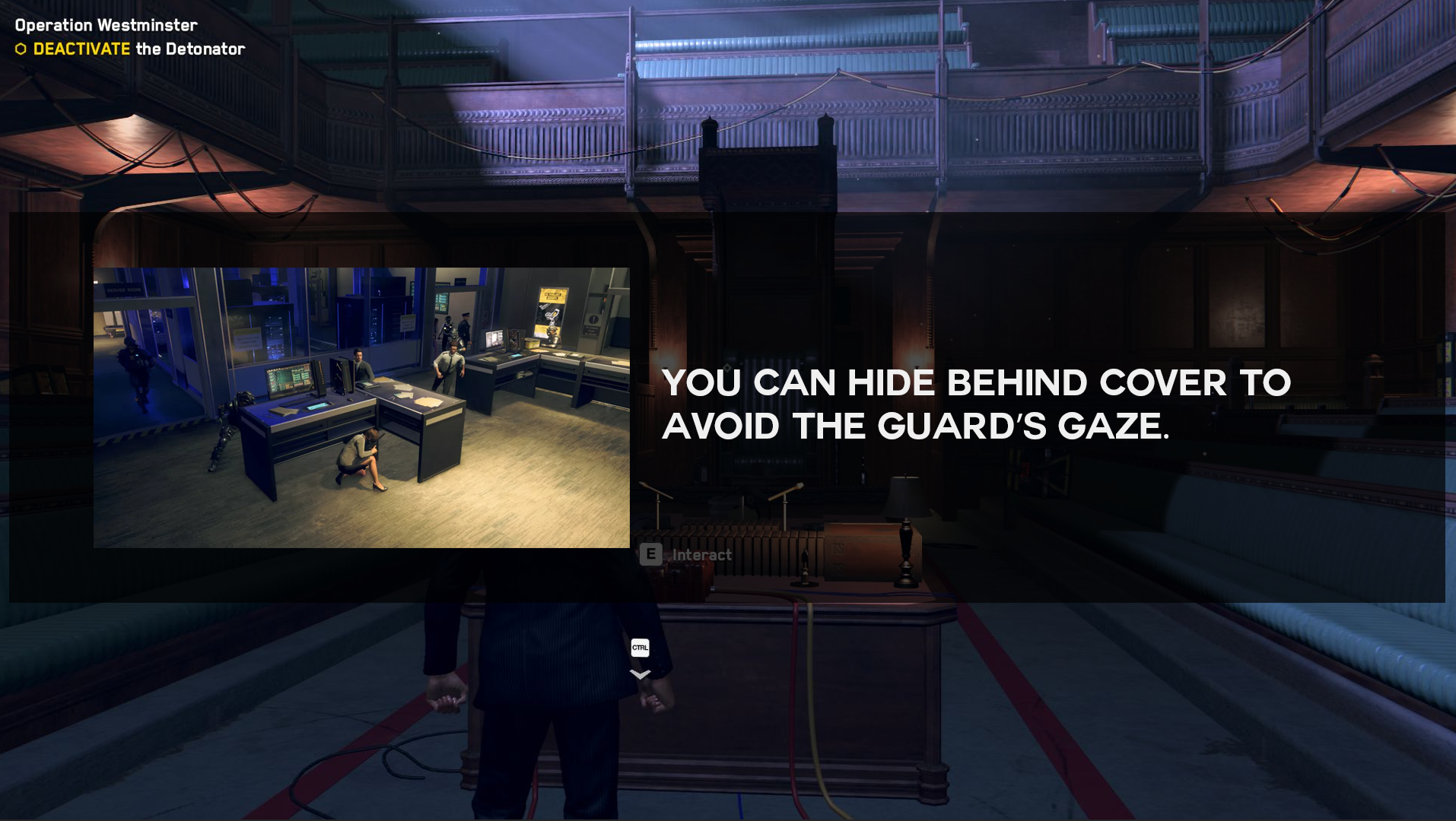
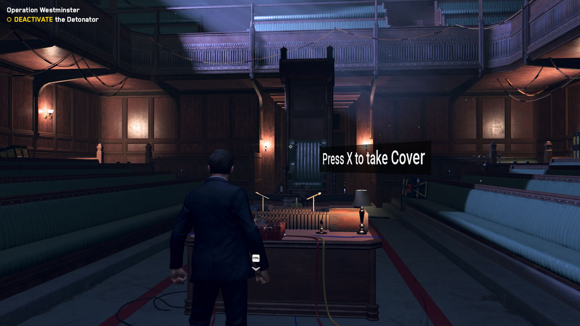
Let’s tell players about things. Source: Author.
Between making sure that players perceive it, follow it, learn from it, add it to their mental models, remember it the next time, and understand the mechanic’s value there are a lot of forms a single interaction can take. If every design was adamant about form following function, the first image might be present in every game. But it is not and there are indeed many ways. If it were imperative that taking cover has to be understood and retained for 100+ hours without the risk of the player missing it at this stage, perhaps option 1 would be a good fit. But if it is a suggested mechanic that plays off a more important mechanic (such as shooting) then using discovery instead of words might suffice as option 3. Each has its own level of invading the game space and disrupting the player’s immersion, which should be chosen as per the importance of the game element it is associated with.
Pick a gun from the ground or go to a full-blown inventory to equip it. Each method is a unique form following its own function. Source: Author.
UI is not the only part under a UX designer’s ownership. There are a host of things, from quality of life to accessibility of controls. Each of these components has its own understanding of how much to invade the game space. While buttons and controllers are strictly outside the screen, their implications are very much in the game space.
In the original Ocarina of Time, players had to go into the inventory every single time to equip and unequip the iron boots. And when they arrived at the water temple, a physical puzzle-level where switching boots is essential, the experience was beyond frustrating.

It took Nintendo 13 year to be able to fix it on the 3DS with the simple ease of life addition using the bottom screen. With this change, the invasion of the menu was substantially reduced in the game space.
UX Designer makes a decision, does that become a game mechanic?
Of course! Whoever said that all ideas in a game come from game designers? It has become a strong notion that UX designers are not supposed to look at anything except interfaces, controls, and accessibility. Yet the cornerstone of the video games industry has always and will always remain innovating methods of play!
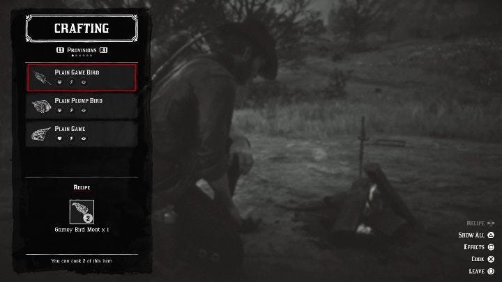
Here is the cooking interaction in Red Dead Redemption 2. While the player-character in the background goes about from chopping to filleting, cooking to eating, all of those commands stem from a simple interface. A recipe is displayed, its requirements are stated, the resources in the player's inventory are stated, and a simple button needs to be pressed to “cook”. And this is considered a marvel of immersion. This is because the collateral surrounding the mechanic immerses players into the world, chiefly hunting and collecting the resources to cook.

Breath of the Wild takes another attempt at the mechanic, allowing players to mix various ingredients together to discover concoctions or follow set recipes. It adds another layer of depth that helps immersion. It also reflects how important cooking is considered by its designers as a mechanic in BotW as compared to RDR2.
Another example is an upcoming (hopefully soon) indie game Magincia by Game Puppets Studio where cooking is a far more crucial mechanic than the previous examples. While the game is all about casting spells, it has an adamant reliance on deep and fleshed out core mechanics.
Source: YouTube.
Unlike the other examples, there are no flat interfaces. Uncooked meat needs to placed on a fire, the temperature needs to be controlled — things need to be physically achieved. The interaction design of this element is much more complicated than anything, which reflects the hierarchical importance of the mechanic with respect to the rest of the game.
As each mechanic jostles less and less with the other mechanics, their form starts to change to reflect the true depth of their function. As the form achieves more and more influential presence in the game world, the flat interface melts away. This can give rise to various inter-relatedness between game systems and can be driven by pure UX design.
Conclusion
Much like service app design, UX in games asks very simple questions — what are the players here to do and how they are helped. The question is not “how can we make this easy” but “how can we help them fulfil what they seek”, whether that is immersion, guidance, sense of achievement, labour of organisation, improving, or simply being delighted. While it is quite easy to have some fill bars and toggles and sprawling grid systems, it is critical to remember that not all parts of the game are equal. And for every level of hierarchy there is in the game systems, it is a function of UX design to understand exactly how much of the 4th wall it should break.
Join the conversation
What do you think? Reply below to share your perspective.