Playing Tabletop RPGs via Figma
Going where no TTRPG-mad Trekkie had gone before

My gaming group loves board games, but we’ve never managed to break into Dungeons and Dragons, or any other tabletop RPG, for that matter. It wasn’t any single specific aspect of tabletop RPGs that prevented us from diving in — for some of us, the medieval fantasy theme didn’t do the trick, while others struggled with the lack of visual elements that would accompany classic board games.
Once COVID hit, I really started to feel the itch to play roleplaying games, however. I was desperate to find a way to play online with my friends which managed to solve some of these issues.
For my group, I wanted a theme that would capture the imagination of my players and that would give me the flexibility to tell fun stories. Since this was right in the heart of the COVID outbreak, I also needed a setting that was as optimistic as it was mysterious and dangerous. There was really only one theme that fit the bill…

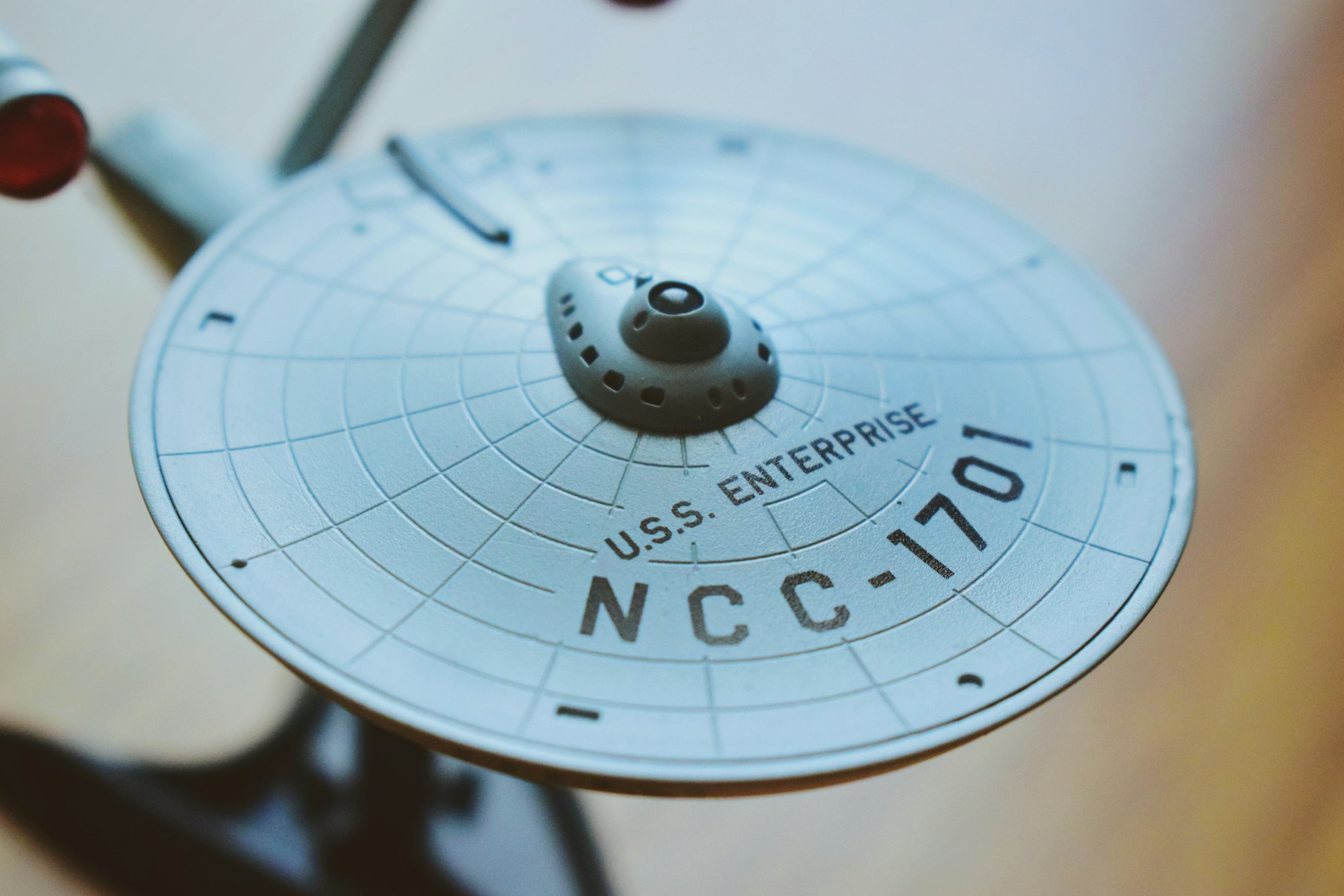
A few people in my group were already big Trek fans, and I myself am a diehard Trekky. It’s a fun, open-ended universe with plenty of avenues to explore. I was really excited about the idea of running a Star Trek adventure, now I just needed an awesome platform to do it on.
There were already some great ways to play paper RPGs online: Roll20 provides a popular, flexible service. Fantasy Grounds has also started to grow in popularity thanks to its enhanced fidelity. Unfortunately, these systems were a little tricky to adapt to the Star Trek ruleset and didn’t provide the flexibility I wanted. I needed to come up with a different way to run my game.
As a UX designer, I use Figma on a daily basis. My team and I often jump into files and collaborate in real time, and it’s a fantastic, seamless experience. I had recently seen that someone had come up with a way to play Settlers of Catan online, in real-time, with multiple players, all in Figma. This really inspired me to see if I could use Figma to play Star Trek Adventures with a group of people, so I set out to create a prototype.
The prototype had to prove that this worked, but also that it was easy enough for anyone to use. My players aren’t designers, and they haven’t used Figma before, so I needed to build something foolproof.
The LCARS UI
I decided to base my design on the classic Star Trek LCARS interfaces, which were used for The Next Generation, Deep Space 9, and Voyager. This was great for an authentic Star Trek look and feel, but I would need to make adjustments for usability.
While I kept the core style of the LCARS interface, I used a much more readable font and more vibrant color treatments. Unless you’re a die-hard Star Trek fan, I don’t think the difference is particularly noticeable, but it made a huge difference to the readability of the UI.
First Prototype
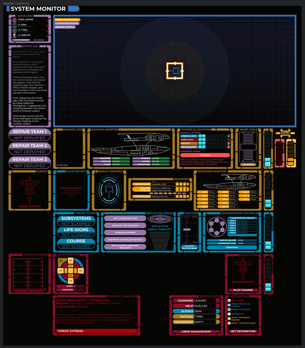
After a few low-fi prototypes, this is what I ended up with. Let me walk you through a few things happening here:
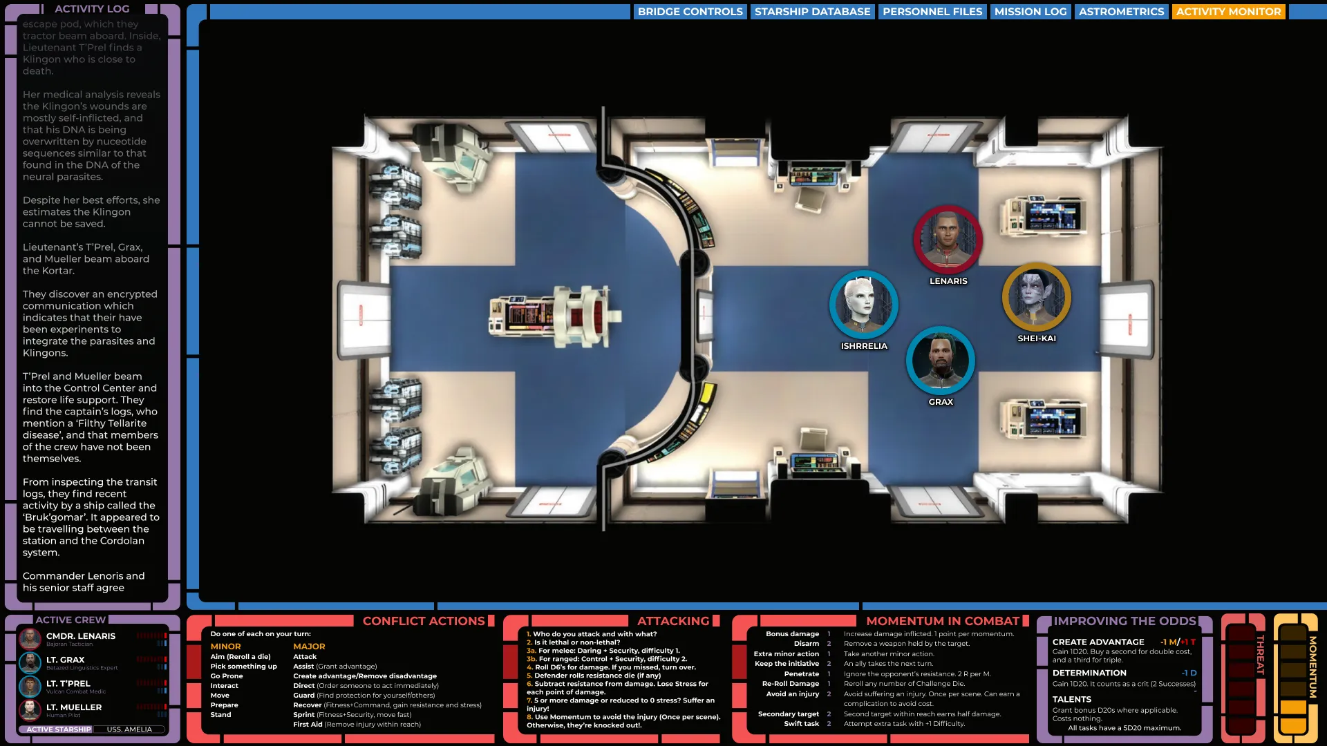
The main player area contained the maps I was using, which sat inside a scrollable frame. This meant players could move around the map on their own screens without affecting the view of anyone else. Everything was locked except the player tokens, so players could move their tokens if they wished, or I could move the token and their screen would update in real-time.
On the left, I kept a log of what was happening in the game, again in real time. This meant players could get a drink, glance at their phone, or simply lose concentration without worrying about missing something vital. This was also scrollable on their screens, so they could go back and review prior events independently of what was happening on the game board.
Lastly, I filled the bottom bar with rules, references, and the status of each player character, as well as their shared resources. This was great for new players who were still learning the rules and acted in a similar way that a DM screen would, but for the players.
We played our first session and this system worked pretty much flawlessly — the less experienced players were able to go into Prototype mode, and just watch the action unfold. Those who wanted to go hands-on could view the file normally and move their own tokens, update their own health, and so on.
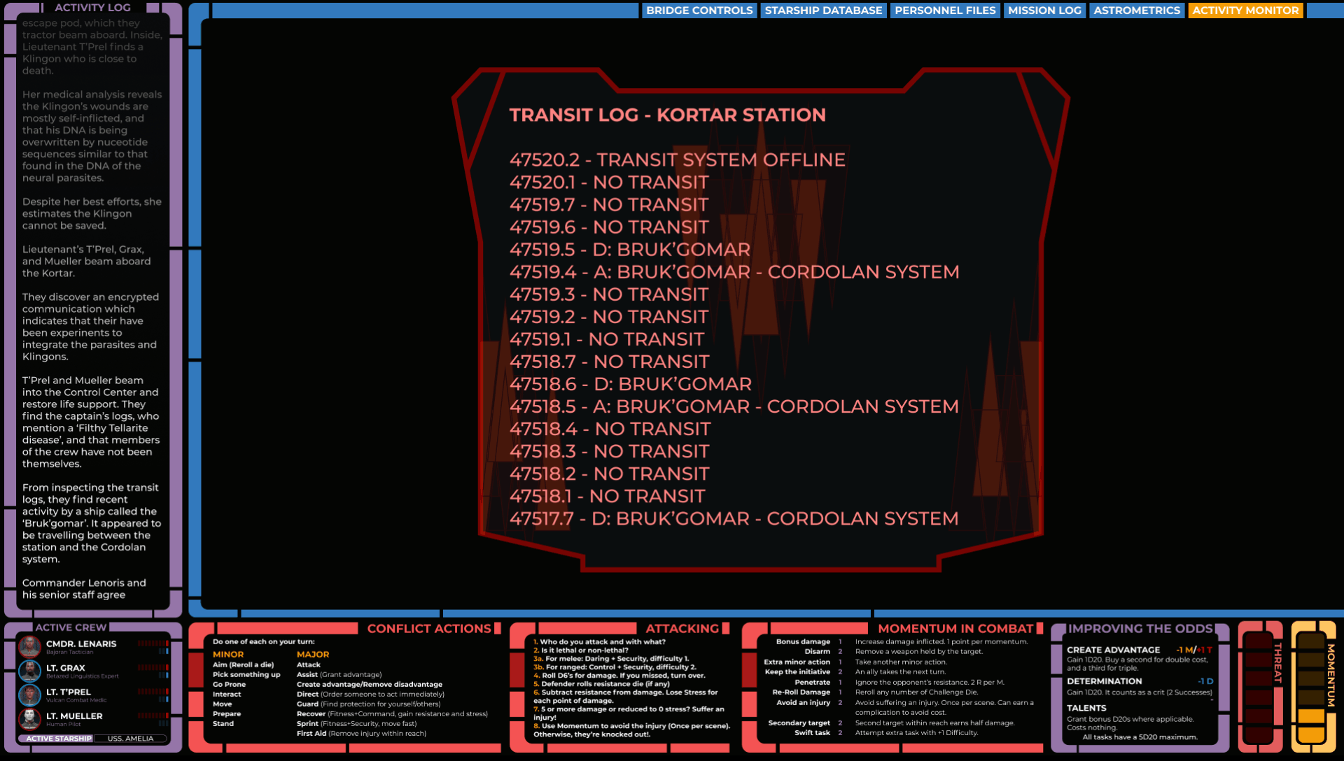
Since a lot of what happens during a Star Trek story involves reading computers, I also created a number of Figma templates for Federation, Klingon, and Romulan computer outputs.
These were built using Auto-Layout, so I was able to quickly paste the text into my component and it would resize automatically. I’d then present these in the viewing area and ask the player who’s interacting with the terminal to read them aloud. This approach to exposition text really helped keep the immersion going.
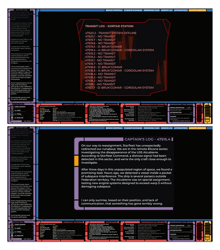
The Database
One thing I’ve always loved in Dungeons and Dragons is keeping a log of my parties’ adventures — recording places we’ve seen, people we’ve met, and what’s happened with the story.
I also wanted to do this for our Star Trek Adventures game, but in a way that felt congruent for the universe. For that reason, I decided to expand the prototype into a computer-like terminal with tabs for different information.
Because my players were all running their own instances of the prototype, they could browse the database without impacting the gameplay. Anything that I wanted them to have a shared view of was a nested component, so I could simply update the master component and their views would change in real time.
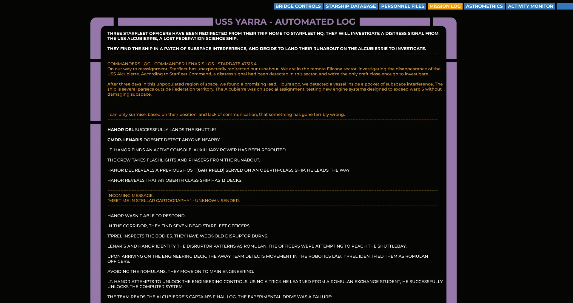
As I was keeping a live feed of the story going during our gameplay sessions, I simply copy and pasted that feed into a mission log at the end of each game. This became an easy, scrollable history of what had happened.
For characters, places, and spacecraft that my crew encountered on their adventures, I didn’t want players to have to scroll through the full mission log. Instead, I created dedicated pages for each.
The character files also acted as digital character sheets for each of the playable characters. This was especially handy for Star Trek Adventures, where players are often interacting with a wide crew, all of which can act as PC’s at any given point.
For spacecraft and locations that the crew had encountered, I also listed story-relevant information so that it could be used as both a gameplay reference and as a narrative refresher.
Rather than create each of these entries in Figma individually, I used the brilliant Google Sheets Sync plugin. The data for each character and ship was contained in a Google Sheet, which I could then import with a single click. This made updating and maintaining the information seamless and easy. Each entry in the database is its own component with auto-layout, so I could modify the content without redesigning the elements.
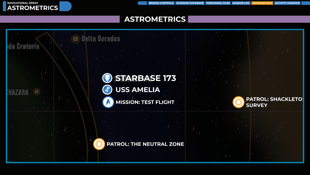
Lastly, I also added an interactive map for the crewmembers. The map is fully scrollable, and each point of interest can be clicked on to learn more. Much like a video game, I added each adventure to the map so that players could choose where to go next in each session.
Overall, I definitely could have stopped here. We had a fully interactive play area, with all the relevant information available to players. With the prototype being fully navigatable, players could look at information separately or share a screen, and everything was maintained from a single source of truth.
However, Star Trek Adventures is unique in that it includes complex ship-to-ship combat. I thought it’d be a fun and interesting challenge to try and recreate that in Figma also and have each player man their own station on the bridge.
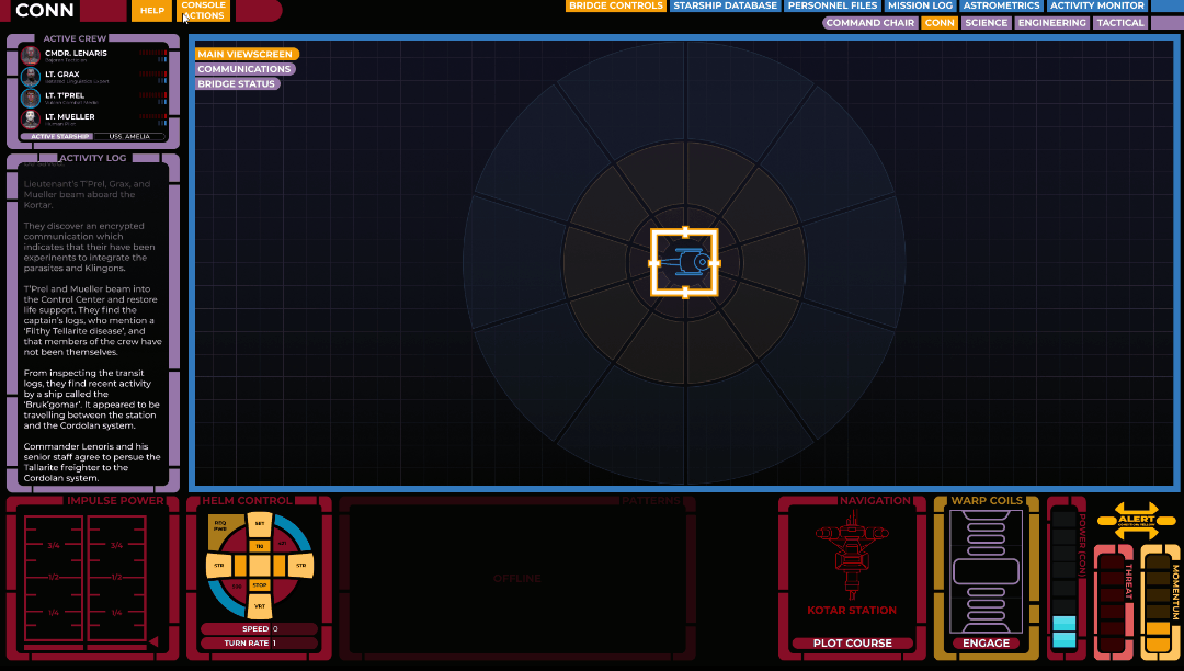
Report to the Bridge
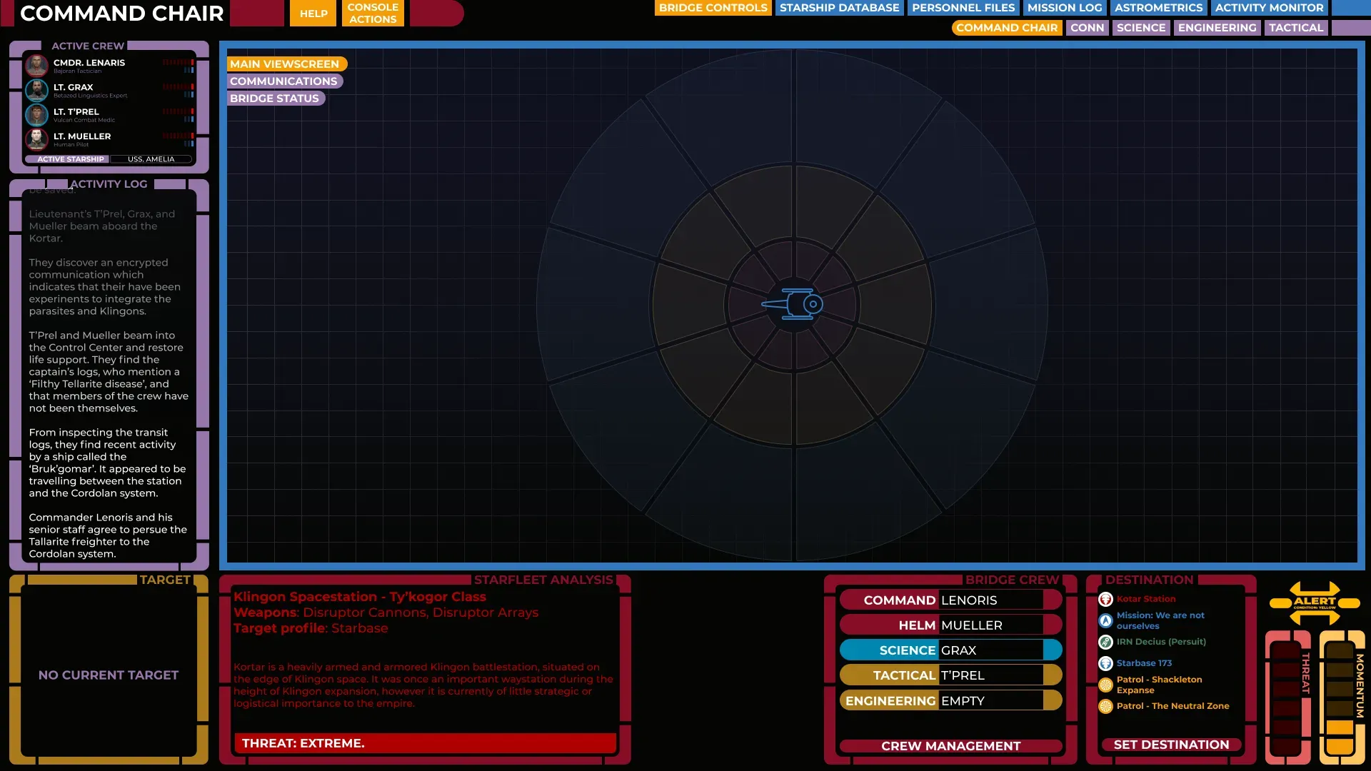
I gave players a new option in their navigation, ‘Bridge Control’, which then asked them to pick a seat on the bridge:

I drew the map of the bridge to match the LCARS style of the interface and made each terminal clickable. Once a player clicked a seat, they were brought to a new, unique interface for that role.
Department colors made it easy to see which station you were manning at a glance. Source: Author.
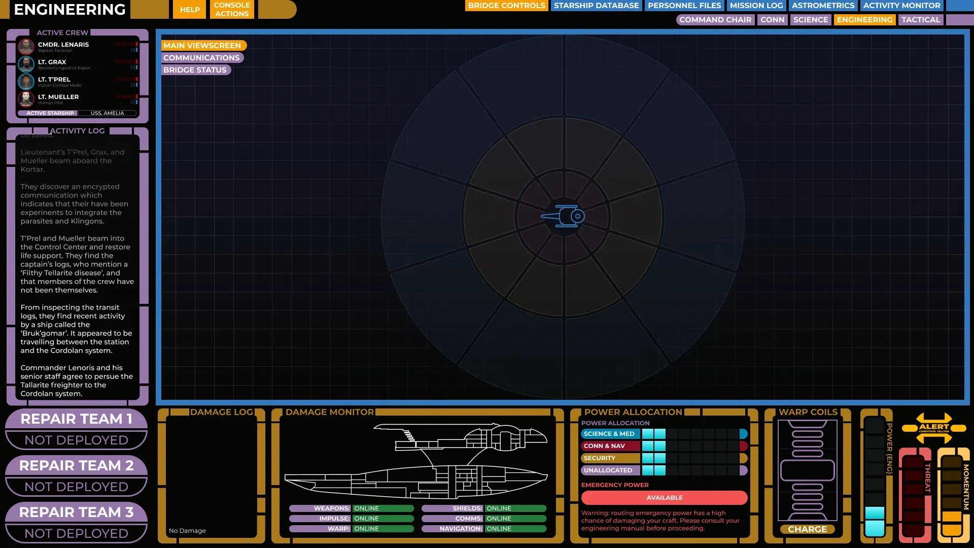
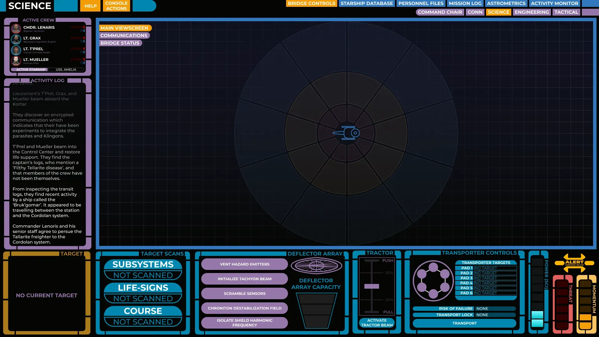
Since I really wanted to capture the Star Trek feel, I created unique control panels for each of the stations that felt authentic to the universe. While some of these controls — like shield management or transporters — had an in-universe design to draw from, for many others I had to intuit based on my own ideas of how they might look.
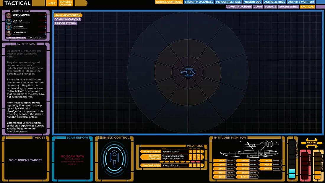
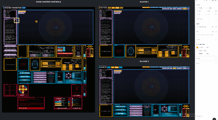
Some panels, such as targeting or power management, were shared across multiple stations. To solve this, I kept a master component on a secret screen that only I could access and updated it when applicable. This way, the child components at each station remained synced. This also worked for the viewscreen.
Since most of my players weren’t going to have the skill set to jump into Figma and take control of their own components, I wanted to make sure I could update their screens in real time as they decided what to do.
For that reason, all the bridge control master components sat on a large artboard that I could use to update.
The whole experience wasn’t unlike playing a video game — my security officer would say “Raise shields” and I’d quickly change the component from ‘Shields down’ to ‘Shields up,’ and their screen would update accordingly.
This also made the usual rigamarole of tracking health, damage, and status effects really easy, as I made the update once on the master file, and that change would be applied to every screen.
I also added tooltips to each panel with how to use the controls there, so players could easily and quickly reference the rules without having to interrupt gameplay.
One small note — keen-eyed Star Trek Adventures fans will notice that we didn’t use the full STA rules for our starship combat. Because of the enhanced capability of having a UI like this, I created a set of homebrew rules that took advantage of how we were playing. I still think STA’s ship combat is a blast, though!
Other Stuff
Along the way, I also created a fair amount of additional assets for use in various ways. Just for fun, here are a few things:
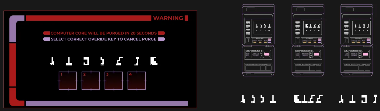
This puzzle was an interesting one. The player operating the computer had to place the targeting reticles onto the appropriate symbols. The other players could only see their symbol sequence and had to try and describe what they were seeing to the operating player. Because they can all see the screen, it was fun to watch the players react to their crewmates picking the right or wrong option.
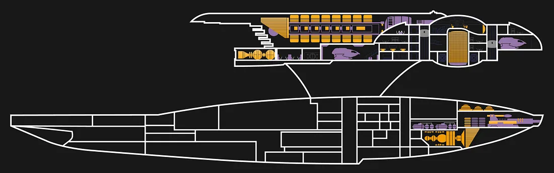
Any good Trekkie will tell you that the ship is the most important character in the show. To help my characters start attaching to their new ship, I used a classic Trek-style MSD (Master Systems Display) and revealed new sections as they used it. This created a sense of space and ownership over the ship.
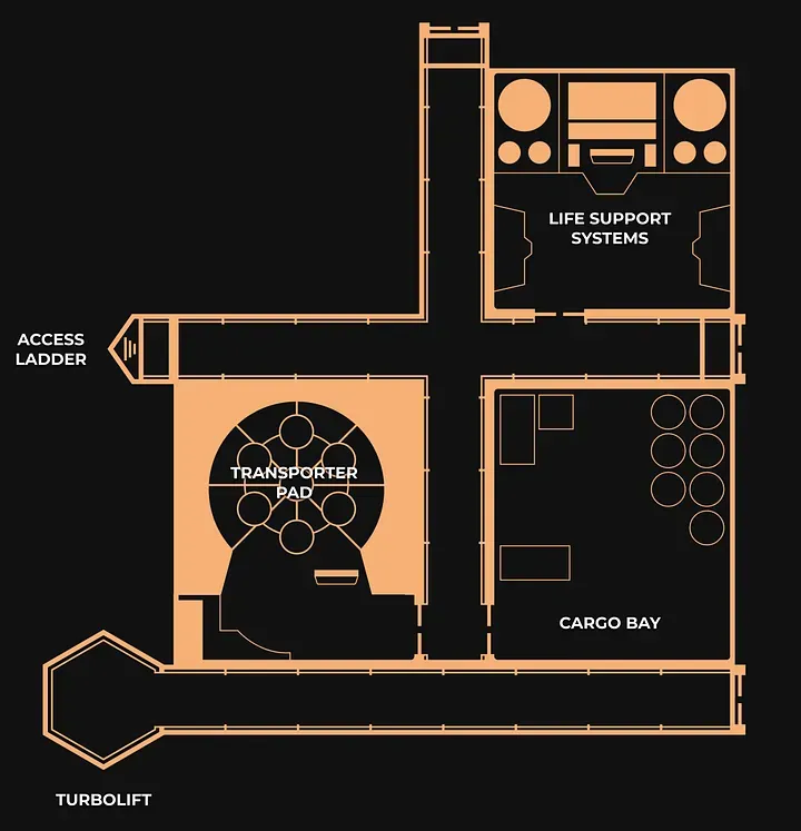
While Modiphius provided a number of gorgeous Star Trek maps on their website, I knew that eventually, I’d need to be creating my own locations and layouts for my players to explore. I needed something quick, easy, and authentic to the Star Trek theme. I created a Star Trek-style tileset for creating my own maps.
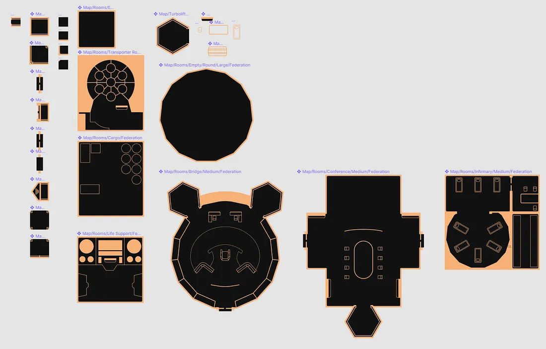
Most of these map components actually use Figma’s auto-layout, so I don’t have to place hundreds of tiles — I can stretch out a corridor to be wider or longer, or adjust the size of a room and have the furniture stay in the right space. It made it really easy to generate quick maps. For more important or complex spaces, I created bespoke layouts but kept all the fixtures and furniture as separate components, so they became reusable in later maps.
Final Thoughts
More than anything though, I loved how my players were able to view different screens from each other, rather than me dictating what they were looking at. Having one player managing the ship’s power, while another is reading information on the enemy from the database screen, was a really Star Trek-like experience that would actually be difficult to reproduce on the tabletop.
I’m well aware that what I’ve shown here is out of reach for most tabletop players, but I hope you found it interesting. Figma’s an amazing tool and while it certainly wasn’t designed to facilitate tabletop roleplaying remotely, it did a damn fine job at it.
The only thing I couldn’t really do in Figma was communication and dice-rolling, but thanks to Discord and the Majel bot, that was easily solved. This might even be solvable in Figma with a dice rolling plugin and the Figma chat plugin, but we were already Discord natives so that felt comfortable.
I would highly recommend anyone with some design skills to try this for themselves — not only is it fun, but this was a great exercise in designing a really complex, intuitive prototype for a really unusual use case.
For those interested, you can view the master file here or launch the player prototype here.
If you’ve got questions on how to do this yourself or would just like to chat about it, feel free to get in touch!
Join the conversation
What do you think? Reply below to share your perspective.