The Magical, Aristocratic Symbolism of The DioField Chronicle
Examining the ideas and techniques in Isamu Kamikokuryo's concept art

Square Enix is well known not only for its JRPGs, but also for its artists and musicians. Legendary game artists include Isamu Kamikokuryo, who left the company in 2017 but continues to partner with Square Enix. One of Kamikokuryo's most recent contributions was his concept art for The DioField Chronicle (2022), a strategy RPG (SRPG) developed in partnership with Lancarse.
Isamu Kamikokuryo was initially interested in oil painting and illustration, but tried to combine this interest with his hobby for video games. After the release of Final Fantasy VII (1997), he decided to dedicate himself to visual design. Three years later he joined Square Enix and was a concept artist for the world of Final Fantasy X.
He would later become primarily known for being art director for the Ivalice Alliance and Fabula Nova Crystallis franchises. His work was fundamental to the aesthetics of the worlds of Final Fantasy XII, XIII, and XV. For these works, he made very detailed paintings and conceived these worlds from an interesting mix of medieval fantasy, nature, and technology.
However, for The DioField Chronicle, Kamikokuryo took both a different thematic and artistic approach. In this feature, I'll examine some of the concepts and techniques that shaped and coloured the fascinating world of this SRPG (and I'll reference The DioField Chronicle Digital Artbook [2022] as a visual guide). My approach to Kamikokuryo's work will be broad; I won't delve into anything specific, but I will take painting and design principles into account, such as concepts of emphasis, value, texture, and space.
Gothic and aristocratic symbolism: concept, form, and space
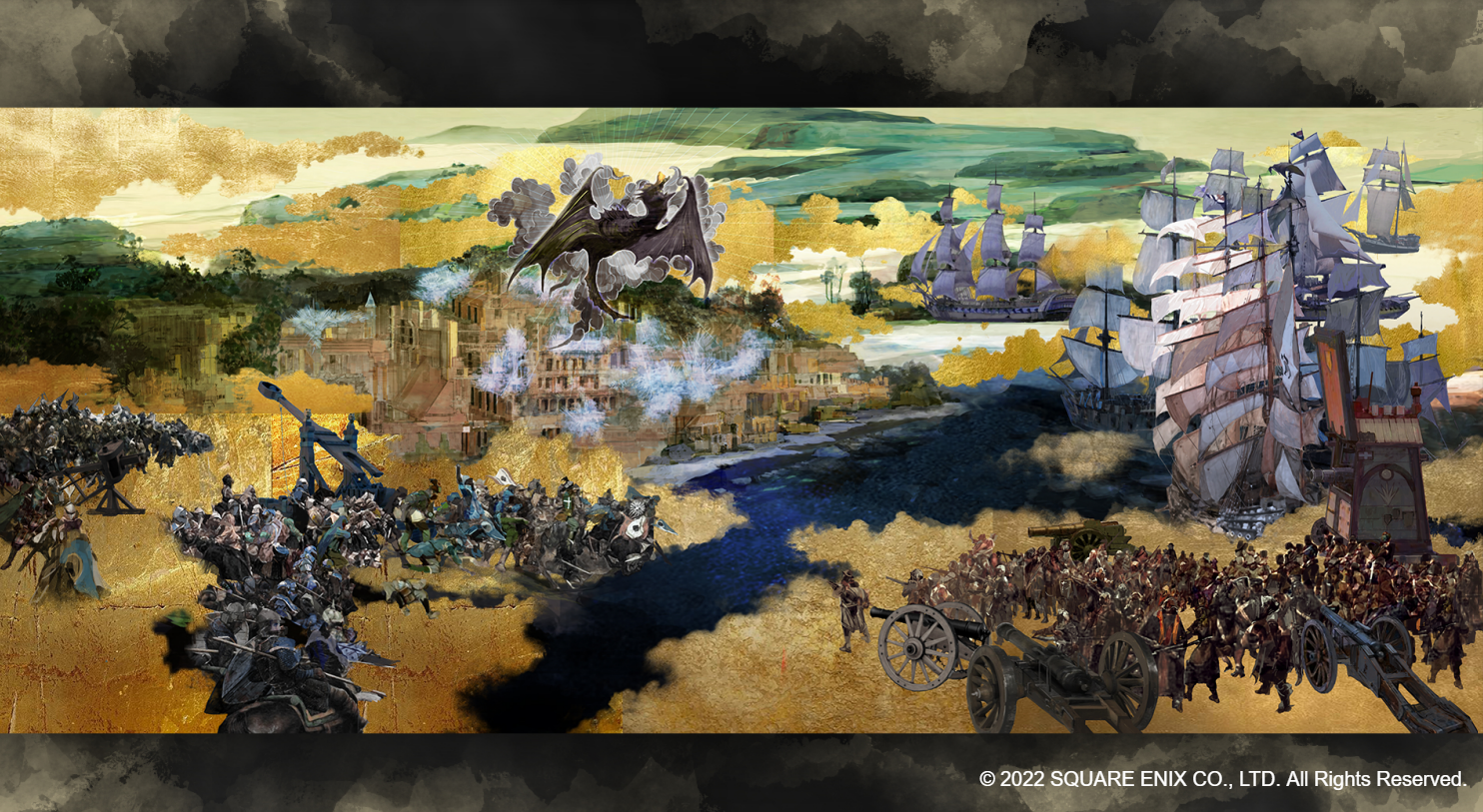
One of the first things that draws attention in the fictional world of The DioField Chronicle is that it has inspirations from medieval Europe and elements from early modernity, such as muskets and gunpowder cannons. This characteristic differs from the setting of Isamu Kamikokuryu's previous works for Final Fantasy XII, XIII, and XV, which mix medieval fantasy with scientific fantasy, through airships, lasers, machines, and computers.
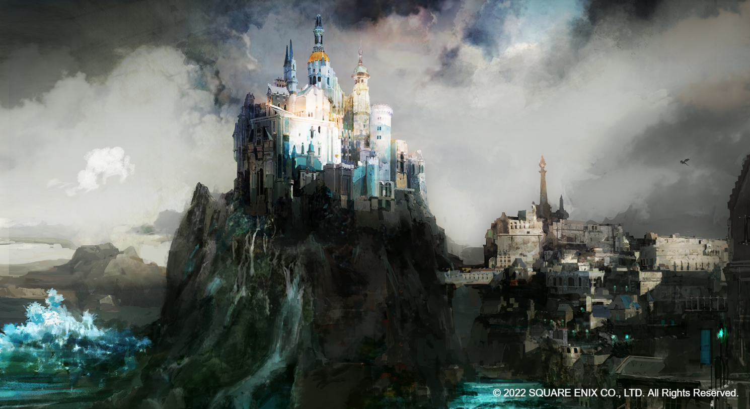
The fantasy of The DioField Chronicle seems more consistent with Game of Thrones. It is not by chance that the composers of the game are the same ones from that HBO series: Ramin Djawadi and Brandon Campbell. However, the scenarios in the game have a more elegant inspiration, a mixture of Victorian and Gothic architecture. In this way, urbanism also fuses with medieval and early modernist influences. An interesting consequence of the Gothic inspiration is the large amount of dark adornments, as well as towers, pillars, and spikes that exude an ominous feeling; the opposite would happen if we saw a more rounded and "friendly" design.
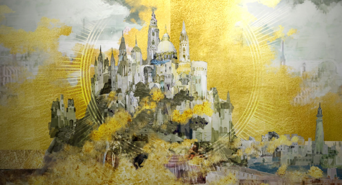
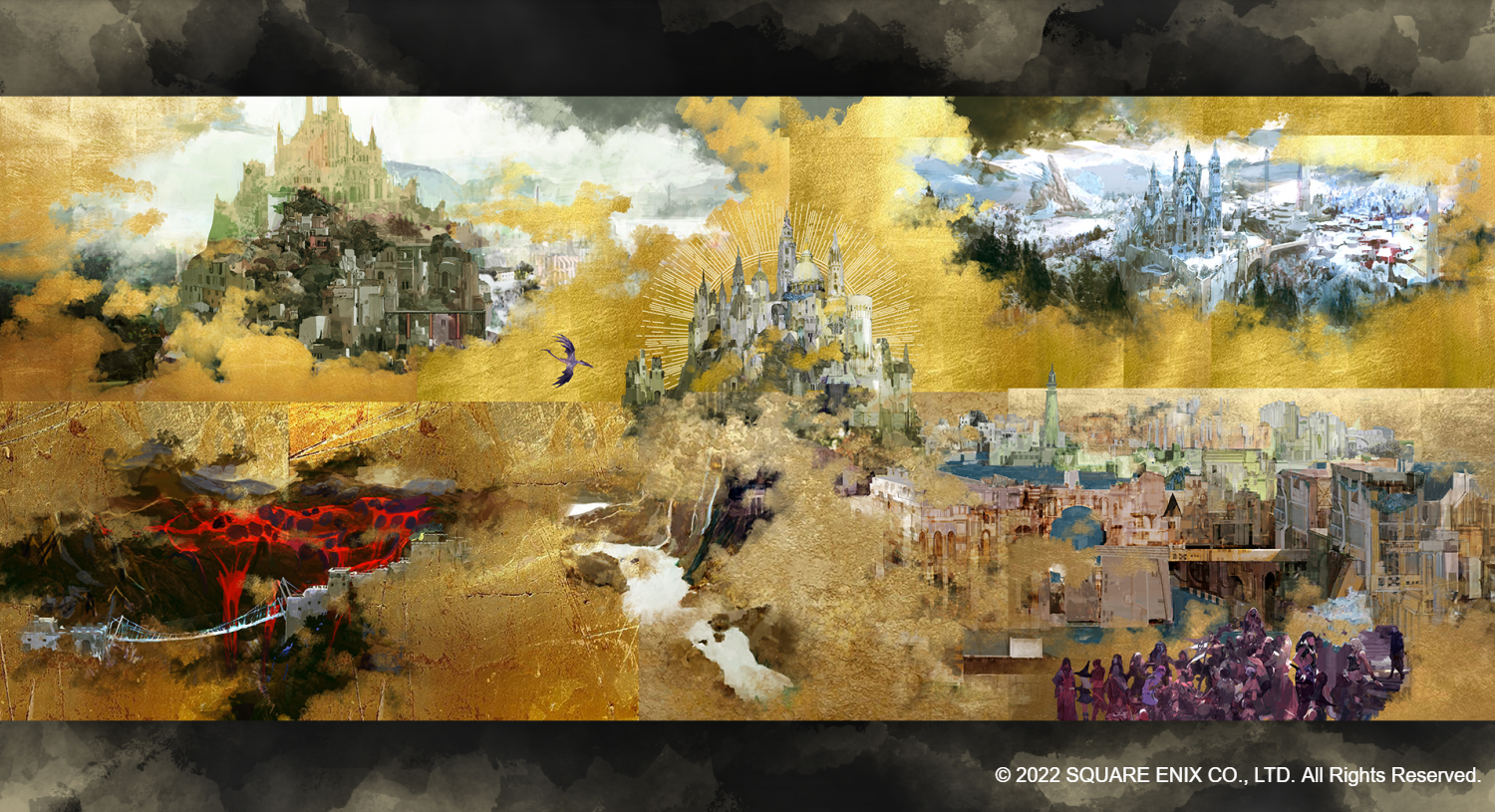
Another thing that stands out is the vibrant golden colour often used in the background of the illustrations in The DioField Chronicle. This artistic choice has the effect of fragmenting Kamikokuryu's visual concepts, as if they were dispersed like clouds, or as if they were elusive as dreams, or were fragmented, like a large unfinished painting.
The use of gold presents other interesting aesthetic meanings. For example, it represents wealth and virtue, which are both traditionally associated with aristocracy. It's no surprise, then, that the aristocracy is a fundamental part of the plot in The DioField Chronicle; this is a story about the conflict surrounding succession to the royal throne. Finally, gold also grants a magical and symbolic aura in relation to the world imagined by Kamikokouryo. This is conceptually similar to the works of Gustav Klint in his "golden phase" paintings, initiated by Pallas Athene (1898).
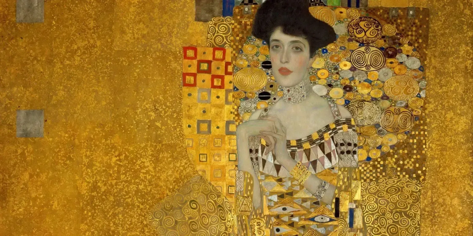
From left to right: "Portrait of Adele Bloch-Bauer I", 1907, oil and gold leaf on canvas, by Gustav Klimt; The DioField Chronicle concept art, by Isamu Kamikokuryo. Sources: viagemeturismo; The DioField Chronicle Digital Artbook.
From concept to execution: shapes, lines, colors, values, and textures
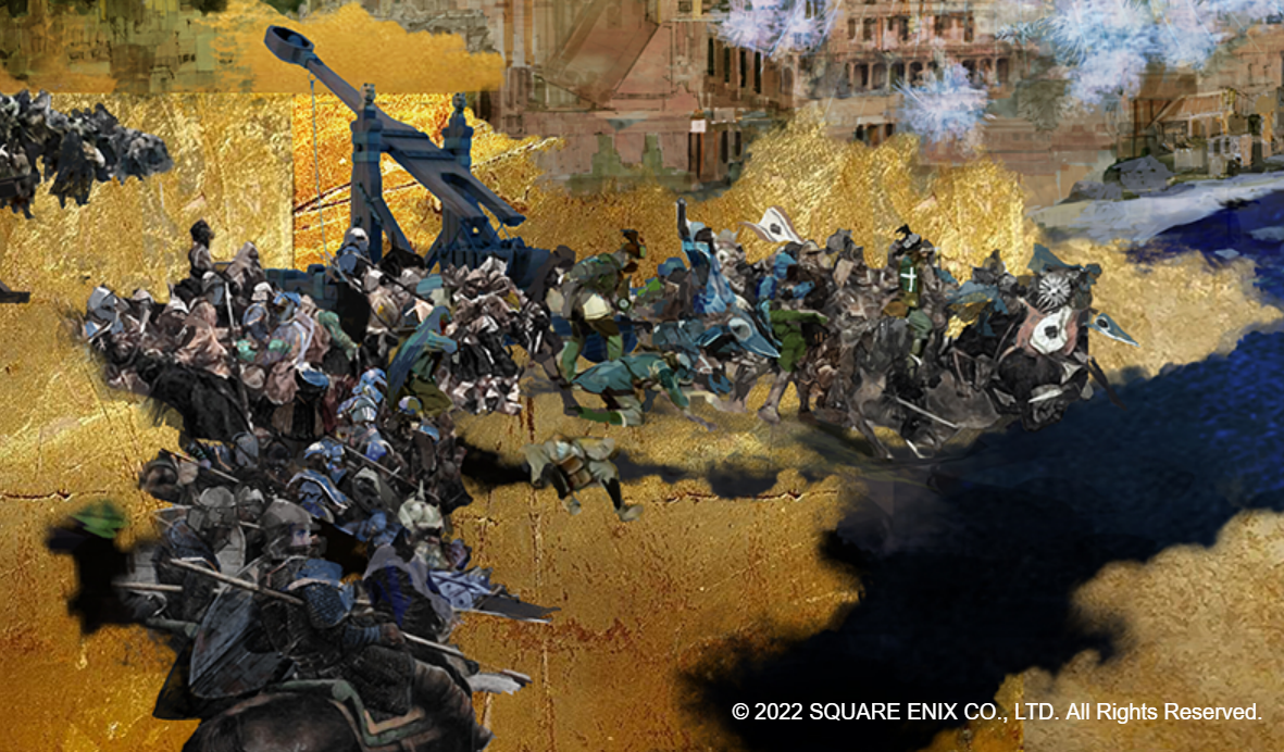
When we immerse ourselves in Kamikokuryo's aristocratic fantasy, we realise his shapes are not rendered with great detail. On the contrary, they have a sketch or draft-like aspect, and only their most central or important elements are rendered in high fidelity to serve the function of the characters who are respresented during relevant scenes.
The main characters have detailed illustrations in the artbook, and were designed in partnership with Taiki (character designer on Lord of Vermilion series), but in this story we are only looking at Kamikokuryo's concept art, so I would like to highlight the design choice in style of sketch he used for his paintings. See below a detail of one of the illustrations that I presented earlier.
Source: The DioField Chronicle Digital Artbook.
Sketch-style art gives the impression of something incomplete or carelessly done, but that's not the only effect of this artistic choice. Making a sketch also means being selective about what to represent in your painting; you need to know what is essential. As concept art, Kamikokuryo wants to give an impression of how medieval and early-modern battles could be modelled in the game. And since the individual characters depicted are not from the main cast, there's little need to establish the identity of each soldier.
You can get a comparative sense of these aspects I have highlighted by looking below at the Battle of Poitiers, a painting by Eugène Delacroix that represents a battle of King John during the Hundred Years' War between France and England. Note that the king is barely recognizable in the sketch. On the left you have the completed painting, in 1830; on the right, you have the sketch of this painting, made between 1829 and 1830.
Another interesting thing to note is the expressiveness of a sketch. As the shapes are a little disfigured and the colouring is a little brusque and rough, a painting in this style conveys a stronger feeling of dynamism, as if it were a moving image. And, depending on the occasion, it might convey a greater tragic expressiveness. Unlike Delacroix, the prince of French romanticism, who sketched only as a study, several modernist artists (from movements such as Expressionism) intentionally utilise this art style, exploring its potential as a way of painting.
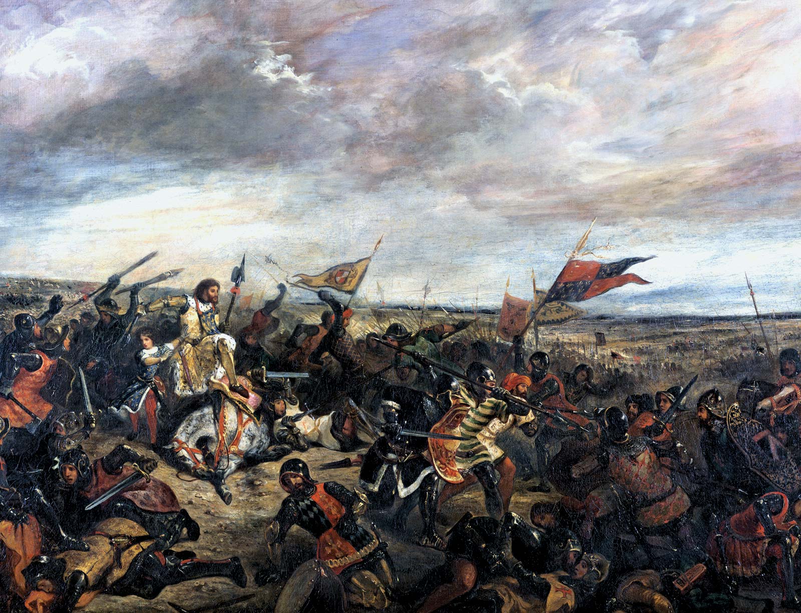
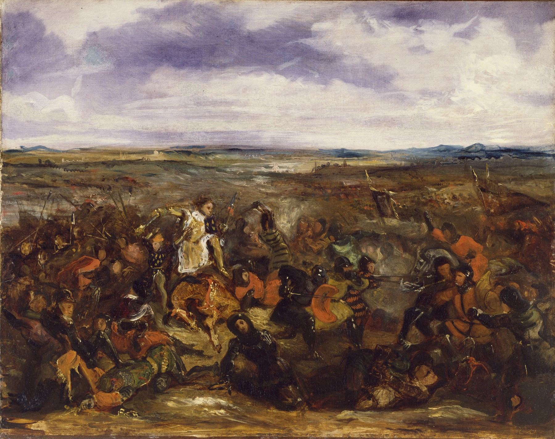
From left to right: "(King John at the) Battle of Poitiers", 1830, oil on canvas, by Eugène Delacroix; "Sketch for the Battle of Poitiers", 1829~1830, oil on canvas, by Eugène Delacroix. Sources: Wiki; Wiki.
Let's now pay attention to the colours. Isamu Kamykokuryo effectively uses the colour blue and transitions from into green very naturally and smoothly, as if the sky and the sea were mixed and what separated them were just the clouds and buildings. This can be seen in the Final Fantasy XII and XIII paintings in the introduction to this story, but also in some of his work in The DioField Chronicle.
For comparison, a similar artistic choice can be found in the paintings of another brilliant Romantic painter, Joseph Mallord William Turner.
The colours that stand out are blue and orange-red (with an incandescent fire tone). These colours are also quite frequent in J. M. W. Turner's watercolour paintings. However, Kamikokuryo opts for a more vivid tone (compare his castle with J. M. W. Turner's in Alnwick Castle). The result looks more like J. M. W. Turner's oil paintings (see the example below). This choice suggests a more fantastic atmosphere to Kamikokuryo's art, and it's interesting to note how minimalist he is with his use of orange and red tones. It is used at a specific point in the construction of the castle, but the contrast it causes is so powerful that it becomes the focus of the viewer's attention.
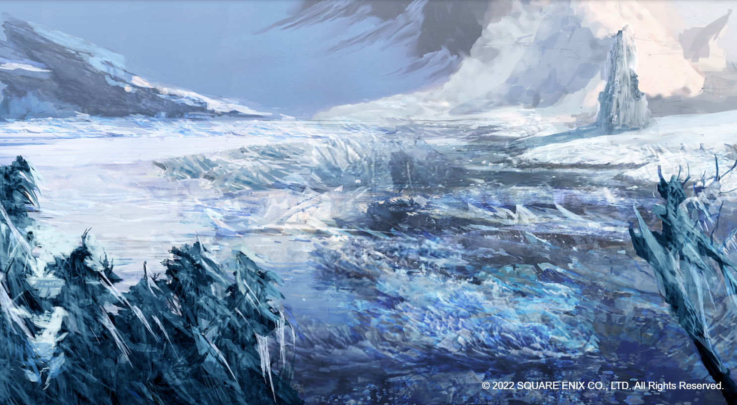
Finally, a few words about the texture of Kamikokuryo paintings. The first thing we need to note is that his paintings for The DioField Chronicle have a lot of layers, and they're done in a somewhat improvised way, but they give a rougher look to the scenes. In the image below, you can see how there is a "thorny terrain" in the snow, with a bunch of lines making shards of ice, and how this blends in with the colouration in the sky, but in the skies there is a softer texture with rounded contours.
This choice of a rougher and heavier texture on the ground makes the environment more threatening. By contrast, look at Claude Monet's impressionist painting Winter Sun at Lavacourt. Like Kamikokuryo's art, it is not a realistic landscape, but he incorporates a light texture with rounded contours in his work along with softer colours. Unlike Kamikokuryo's artwork for The DioField Chronicle, Monet's painting brings comfort and cosiness.
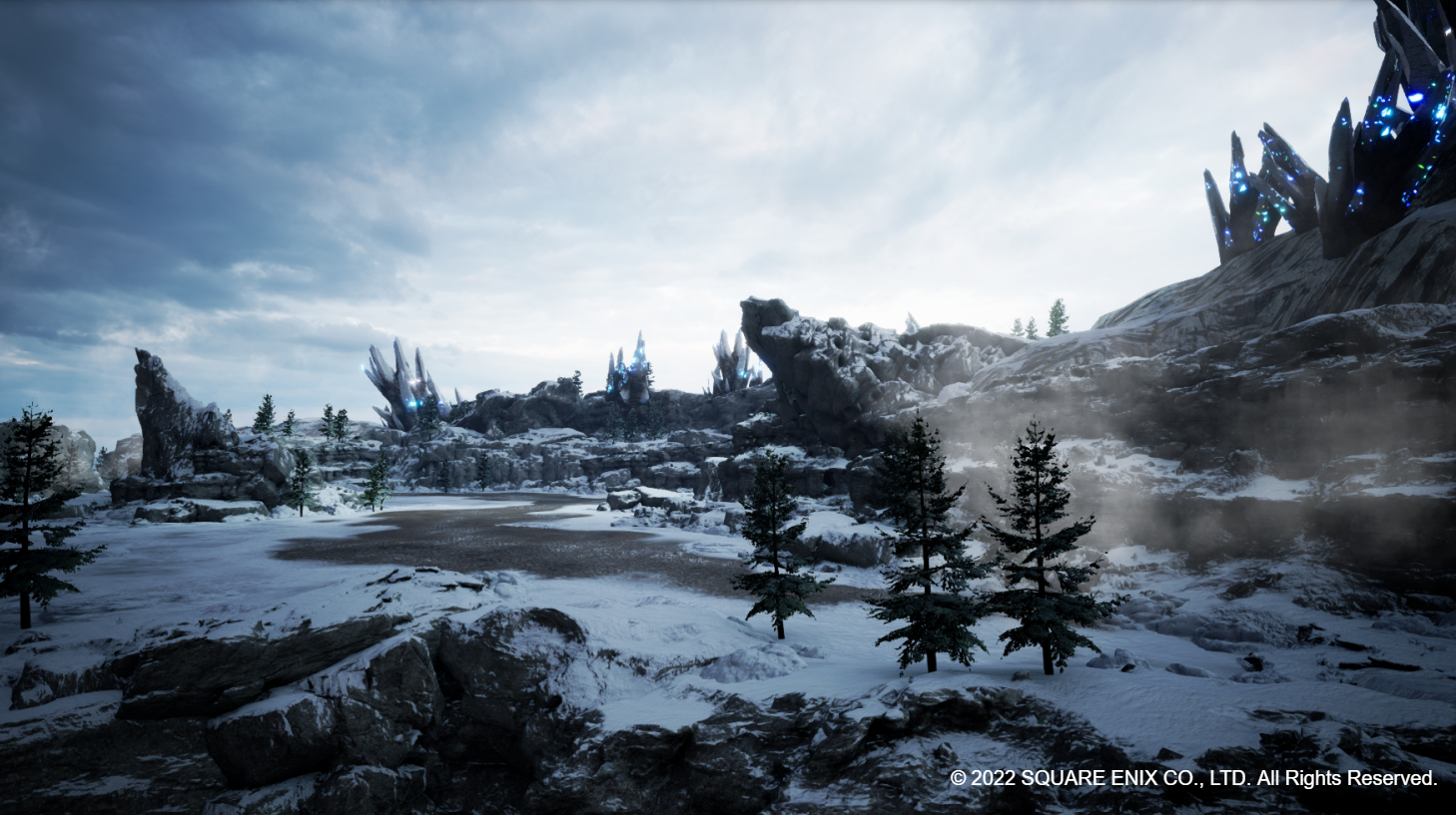
Of course, this rougher and more menacing aspect of the cold is represented in the game's 3D modelling. See the last image below. I feel that atmosphere isn't fully captured by the game's realistic choice of design, but we can still see an emphasis on rocks and vegetation that make the terrain rougher, in contrast to the skies.
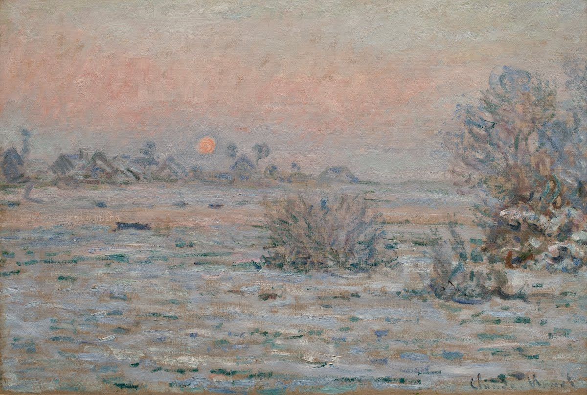
From left to right: "Winter Sun at Lavacourt", 1879~1880, oil on canvas, by Claude Monet; The DioField Chronicle. Sources: Arts & Culture; The DioField Chronicle Digital Artbook.
This was a brief overview of Isamu Kamikokuryo's work for The DioField Chronicle. I had the opportunity to review this game for Nintendo Blast (Portuguese) and I was especially interested in its art design. But the game also has other strong points, such as the soundtrack and the dynamic real-time strategy RPG system (a rarity these days).
If you are interested in other works by Isamu Kamikokuryo, I recommend watching Isamu Kamikokuryo, Art Directing Final Fantasy - Archipel Caravan on YouTube. It is also worth remembering that The DioField Chronicle Digital Artbook can be purchased on Steam.
Join the conversation
What do you think? Reply below to share your perspective.